- 1 Introduction
- 2 Elements of data visualization
- 3 Design strategies to display natural capital information
- 4 Conclusion
- Bibliography
This document aims to support ES analysts striving to effectively communicate natural capital information. It proposes approaches to ES visualizations and summaries in the form of a toolbox tailored to the specific needs of ES analysts, supported by fundamental and applied data visualization guidelines. This toolbox was developed as part of a master’s thesis, and contains a subset of its chapters.
1 Introduction
“Often the importance of ecosystem services is widely appreciated only upon their loss”
Gretchen Daily, in The Value of Nature and the Nature of Value
1.1 How to read this document
The document is organized to allow a reader to skim through the display tasks and suggested solutions, and focus on details where relevant. Embedded references and hyperlinks allows to navigate between sections in this interactive document; the web visualizations listed have embedded links. For a quick answer to a specific display need, table sec:table summarizes the relevant options for the main display tasks.
Because of the context-specific nature of efficient data visualization, the approach of selecting a “best” solution for each display appears to be irrelevant. Therefore this document is organized as a toolbox suggesting several strategies for each case, from which the analyst can take inspiration and adapt the solution to fit his or her needs. Each proposed display is explained, discussed (pros and cons) and illustrated with relevant use cases and/or examples. This user guidance aims to serve as a basis and an inspiration to the analyst, suggesting several options to be used and adapted to each case. It is essential to tailor the display according to:
- the goal of the display: What is the key message to convey?
- the audience targeted: Who is the display intended for? What is their level of knowledge about the project and their familiarity with scientific visualizations?
- the time available: Both the time expected spent by the user on the display, and the time to build the visualization. Should this convey just the key results or go in depth about the analysis?
- the document type: Static, dynamic, interactive?
- the presentation type: How will it be released? Should this be self explanatory or will it be presented by the analyst?
1.2 Background & motivation
1.2.1 Ecosystem services & natural capital assessments
Ecosystem services (ES) are essential gifts from nature making life possible and worthwhile. They rely on complex interactions of many forms of natural capital. However, about 60% of the ecosystem services are being degraded1 or are not used sustainably. As the stock of natural capital decreases, due to clear and increasing human alteration (Vitousek et al. 1997), citizens and scholars are increasingly highlighting the urgency of taking action to protect it. To do so, efficient policy design requires a strong (often quantitative) understanding of ecosystem services functioning.
Such an understanding can be achieved through natural capital assessments, which locate the sources of ecosystem services, provide indications for sustainable management, identify and prioritize conservation activities, help build understanding of synergies and trade-offs between the needs and impacts of different projects or sectors, support policy design, and contribute to climate resilience and adaptation planning. These assessments document ecosystem services at different levels, from local ones such as pest control, to regional ones like flood control, to global services such as climate stabilization. They reveal interdependencies between services, critical points and timescales for degradation and recovery (Daily et al. 2000).
Natural capital assessements aim to reveal the specific benefits provided by nature, in order to develop approaches to manage environmental assets sustainably and make it easier for nature to become a primary consideration in all decisions
1.2.2 Communicating natural capital information
Given their complexity, natural capital assessments involve a substantial understanding of phenomena and their interactions, often requiring significant studies and modeling efforts. However, these efforts will do little to achieve their intended goal of informing decisions unless the insights they generate are effectively communicated to provide usable information to decision-makers. Therefore, the present work aims to put an emphasis on this last step of process, that is, conveying the results – in particular, strategies for visualization, which are often neglected in time-limited projects which had focused on the previous steps.
Visualization is the main focus of this work, because it has been proven to be easier for the brain to understand an image than words or numbers (Cukier 2010). Because of their abilities to synthesize large amounts of data into effective displays (Ware 2000), graphics have been widely used in the literature. Plus, it had been shown that judgement often results from fast and automatic processing, generally prompted by visuals (McMahon et al. 2016) and that combining optimization with visualization promotes design innovations and empowers decision makers with a better understanding of systems behaviors (see for example the work of Kollat and Reed (2007), Reed and Minsker (2004), Fleming et al. (2005), Winer and Bloebaum (2002). More specifically for spatial data, mapping, defined by Englund et al. (2017) as the organization of spatially explicit quantitative information, has proven essential for many assessments of ES (Troy and Wilson 2006). Hauck et al. (2013) showed how maps are tremendously helpful to support proper management of ecosystems and ecosystem services. However, he also brings attention to the fact that they should be used carefully.
Not only visuals, but effective visuals are crucial to achieve the intended goal of informing their audience. This work draws from the widely studied topic of information visualization (by Cleveland, Ware, Tufte among others). Visualizations of large datasets and complex information is a very effective way to conveying knowledge, but it is also non-trivial, which might explain why this topic is given so much attention in the literature.
Visualizations support both data analysis and data presentation. The latter is the focus of this work, which assumes that at least some initial results are generated. However, visualizations are not distinctly intended to serve just one purpose, and the same displays may also be of use for exploratory analysis by the analyst, to help build insight, especially to the extent that both an analyst’s own work and their stakeholder engagement are iterative.
Developing visuals that communicate the complexities of natural capital assessments is admittedly difficult, even with existing visual tools and expertise. A preliminary part of this work consisted in identifying the specific challenges related to displaying ES results. ES information consists in varied, large, multi-dimensional datasets, often including large numbers of results that come from considering multiple objectives, scenarios, and uncertainties. These can be categorical or continuous, spatial or aspatial. The main tasks that these displays aim to support include scenario analysis, multi-objective comparisons, and expression of uncertainty. Some cases may require combinations of these tasks.
1.3 Objectives & outline
This document is intended to support and guide analysts in their task of communicating natural capital information. This work proposes approaches to ES visualizations and summaries in a toolbox tailored to the specific needs of ES analysts, supported by fundamental and applied data visualization guidelines. The toolbox of visualization techniques is structured around four main themes: displaying multi-dimensional data, displaying spatial data, comparing multiple versions of spatial data, and expressing uncertainty (this organization attempts to follow these themes despite the many overlaps).
First, one may ask what makes a visualization successful? Chapter 2 provides the background knowledge on the fundamentals of data visualization, key principles, guidelines and also briefly addresses the question of which tools to use.
Then, chapter 3 gives an overview of design strategies for displaying the type of data encountered in natural capital projects. It suggests effective solutions to synthesize and communicate spatial, multi-dimensional outputs of multiple runs for multiple ES models, based on an extended literature review about visualization approaches in neighboring fields.
1.4 Assessment of the quality of a visualization
It is a rather subjective task to assess the quality of suggested solutions. To increase objectivity, several criteria were considered, specifically the imperatives for visualization, defined by (Stephens et al. 2012) in the context of ensemble predictions (figure fig:crit1), and also the criteria of clarity and completeness detailed by Allen et al. (2012). The selection of solutions is guided by these established criteria
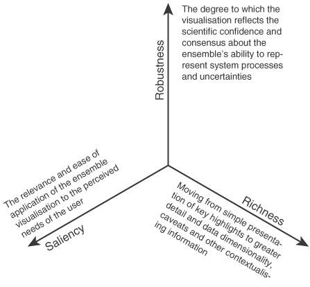
Figure 1: Imperatives for visualization, defined by (Stephens et al. 2012) in the context of ensemble predictions: richness, saliency, and robustness.
1.5 Acronyms & Terminology
Important concepts & terminology
The field of ecosystem services suffers some inconsistent terminology in literature (Englund et al. 2017). Hence, an effort is made here to define precisely the terms used, point out synonyms and vague terminology, to avoid confusions.
- Natural capital: Natural capital includes all environmental assets, it is the stock of resources, such a rivers, trees, the atmosphere and all living organisms (Natural Capital Scotland Ltd 2015)
- ES: Ecosystem services are the benefits natural capital assets provide to humanity (Cardinale et al. 2012)
- SDU: spatial decision unit, corresponding to a geometric feature such as polygon, pixel, lines or point. SDU represent the scale at which a discrete spatial decision/intervention is undertaken. In the context of map comparisons, the word “cell” is used in this work for SDU, to match with the literature on the topic.
- LULC: land use/land cover
- intervention/activity: an action that can be taken on a spatial decision unit that gets reflected in parameters that feed an ecosystem services model
- portfolio: A set of SDU’s and chosen activities for each SDU, emerging from an optimizer, from RIOS, or a participatory prioritization process. Portfolios get overlayed on LULC’s to run the model
- scenarios: storylines that describe possible futures (but are not predictions) (Verutes et al. 2015) (e.g an LULC scenario corresponds to an LULC map that has been changed based on modeled or user-defined changes to represent plausible futures)
- spatial targeting: prioritization of interventions and their location on a landscape, can be undertaken with formal optimization methods, or heuristic or participatory approaches
- SOW: state of the world (scenario with quantitative definition)
Jargon of the field
- ABM: Agent-Based Modeling (computational modeling of phenomena as dynamical systems of interacting agents)
- API: Application Programming Interface
- EIA: Environmental Impact Assessment
- GIS: Geographical Information Systems
- IWS: Investments in watershed services (known as Water Fund)
- MOEA: Multi-objective evolutionary algorithm
- MOVA: Multi-objective visual analytics
- OGR: OpenGIS Simple Features Reference Implementation
- OR: Operational research
- PCA: Principal component analysis
- PFF: Production possibilities frontier (economical term for tradeoff curve)
- RO: Robust optimization
- SA: Sensitivity analysis
- SLR: Sea Level Rise
- SDSS: Spatial decision support systems
- UA: uncertainty analysis
Softwares and models
- CV: Coastal Vulnerability (an InVEST model)
- HRA: Habitat Risk Assessment (an InVEST model)
- InVEST: Integrated Valuation of Ecosystem Services and Trade-offs
- GDAL: Geospatial Data Abstraction Library
- MESH: Mapping Ecosystem Services to Human well-being
- RIOS: The Resource Investment Optimization System
- SDR: Sediment delivery ratio (an InVEST model)
- VIDEO: Visually Interactive Decision-making and Design using Evolutionary Multi-objective Optimization
2 Elements of data visualization
“Excellence in statistical graphics consists of complex ideas communicated with clarity, precision and efficiency.”
Edward Tufte
This chapter aims to lay out the context and basics of data visualization, and thereby establish the background knowledge to contextualize and further investigate specific display strategies. First, a brief overview of some general notions in data visualization is given to familiarize with the context, along with guidelines for successful implementation. Then, an overview of the multiple visualization tools is provided, aiming to support ES analysts to choose the most adapted software or library for each application.
2.1 Notions and techniques in data visualization
2.1.1 Information visualization and graphical integrity
Information visualization, or visual communication, consists in transforming complex and abstract data into an accessible and concrete form, that a human brain can perceive with as little as possible cognitive effort. It consists simply in encoding data into visual objects, such as lines or points (Tufte 1983). The goal of a visualization is to effectively convey information (Kelleher and Wagener 2011).
In order to achieve this aim honestly, graphical integrity considerations must be kept in mind throughout the process of building visualizations. It has been shown that graphs can clearly be misleading because of design choices (Allen et al. 2012). Graphical integrity consists in accurate representations of data, avoiding distortions or misleading designs. To this end, data must be shown in its context, well-known units and clear labeling should be used to avoid ambiguity and true proportions must be kept in representing numbers (Tufte 1983).
Graphical integrity considerations in the context of ES are especially relevant concerning uncertainty representation, scenarios displays and scales. Hiding some uncertainties, or some scenarios considered during the analysis, may be considered dishonest (McMahon et al. 2016), however analyst may decide to show a subset only in order to focus on the core message but showing the relevant context is necessary to a global understanding. Graphical integrity considerations also needs to be taken into account in the choice of the scale: it is important to normalize2 it, and use the same scale on comparable figures, to avoid biasing comparisons.
2.1.2 Vocabulary and grammar of graphics
Graphs, charts, diagrams and plots, despite ambiguous nuances, are all defined as representations of data, these words will be used synonymously in this work. A graph consists in at least one dataset translated into a set of mappings (i.e. visual encodings), forming layers that are statistically transformed according to the scale, the coordinate system and the facet specification3. Refer to Wickham (2008) and Wilkinson (2006) for additional details about the grammar of graphics.
Spatial data , presents its own visualization and handling challenges, it is therefore typically handled with specific tools, so called geographical information systems (GIS) which link geographic (e.g. maps) and descriptive information. Data is organized in different layers, associated based on their geography. Spatial data can be stored in two types: raster, which is a gridded collection of pixels referenced with coordinates, and vector, which corresponds to a set of points, lines, and polygons. Different projections and coordinate systems are of great importance when dealing with spatial data: the round shape of the earth is different from the flat projections of the maps and this means that distortion cannot be avoided. These projections conserve either the shape, or the area for example but cannot conserve all measures (Medeiros 2016). For further information regarding GIS, we point out to the myriad of work in this vast field, among others, the book written by De Smith et al. (2007).
2.1.3 Modes of visualization
Visualization can be delivered in different forms. There are three main groupings of visual information delivery modes:
- Static presentations are required for printed format and often essential. In the context of inter-organizational projects, there is almost always a need to summarize results in static reports.
- Dynamic user-interactive visualizations give the greatest flexibility to the user who is given options to test and visualize results while having some control on the display. In many cases, user interactivity enhances the user’s implication and satisfaction (Teo et al. 2003). Dynamic displays offers many options to tailored and multi-dimensional visualizations. Section sec:interactivefeatures will detail some of the main features of interest.
- Dynamic storytelling is part way between the two previous visualization modes: it is a dynamic animation, but not fully interactive. The viewer is guided through the visualization, either by a presenter, or step-by-step through the storyline, (s)he therefore has less flexibility to “play around” with the variables, but it can result in easier delivery of key messages. Especially useful during presentations, but also on webpages, the dynamic storytelling allows the flexibility and multi-dimensional displays options of dynamic visualizations, while keeping control on the selected options, i.e. walking the user through the visualization to lead to the envisioned goal.
2.1.4 Distortion techniques
When displaying large datasets, combining information on different scales can become very tricky. As noted earlier (sec:graphintegrity), graphical integrity requires to present the context of the dataset. However, when attempting to show local variations, displaying two scales at once is a notable challenge. Some distortion techniques have been developed in order to view precisely local details in their global context. They allows a greater space to the display of a focused zone, while still embedding its surrounding context. Generally, linear or hyperbolic geometry supports the smooth connection of the focus area and the background, that have different scales (Leung and Apperley 1994). Distortion techniques include:
- bifocal display (or lens) corresponds simply to a linear transformation (in one or two directions) (Apperley et al. (1982), Leung and Apperley (1994)).
- polyfocal lens is similar to bifocal lens, but using a more complex hyperbolic (or polynomial) transformation function (Leung and Apperley 1994).
- fisheye view, originally called Focus + Context technique (Lamping et al. (1995) and Furnas (1986)) uses a continuous magnification function (that also transforms the boundaries). Tough this term has been used with different definitions, it is broadly used and very intuitive.
- there are other less common options among which can be mentioned the perspective wall (Mackinlay et al. 1991), that simulates the perspective effect or the hyperbolic tree that extends the fisheye view using hyperbolic plane mapped onto a circular display region (Lamping et al. 1995).
2.1.5 Interaction techniques
A few interactive features of interest include (Wilhelm et al. 1995):
- Scaling, which is simply the ability to zoom in and out, is powerful in the sense that it allows the user to both a global view of the whole dataset and a view of precise details on smaller variations, therefore removing the need for a distorted view. Some scaling options also combine distortion techniques (see section sec:disto) to both zoom in and keep the background context in the surroundings.
- Identification (also called pointing) allows access to detailed information of a subset of the graph by clicking on it.
- Generalized selection visually highlights or extracts in some way every linked graphical element that is associated with the user’s selection for an overview of subsets. The association rules are defined according to the case.
- Brushing consists in selecting a subset of data, that is then highlighted. Also, brushing can be used to remove unwanted data, when a specific threshold defines a subset of interest (Kollat and Reed 2007). Brushing can be done with a slider, or with direct selection on the plot (Ward 1994).
- In a context where the displays consists in several views (different plots), linking adds value to brushing: it is the dynamic update of the other graphs displayed, to undergo the corresponding «brushed» selection (Buja et al. 1996).
2.2 Graphical best practices and guidelines
What makes a good visualization? Keeping in mind the goal which is to effectively convey information, i.e. to gain insight on the data, an efficient visualization reduces the cognitive effort of understanding the graph, in order to bring the observer’s attention to the actual facts. Some may seem trivial, nevertheless the guidelines summarized in the following paragraphs are essential to achieving the intended purpose. As described by an expert in data visualization, Tufte (1983) in his classic text (p.13), graphical displays should:
- “show the data,
- induce the viewer to think about the substance rather than about methodology, graphic design, the technology of graphic production,…
- avoid distorting what the data has to say,
- present many numbers in a small space,
- make large data sets coherent,
- encourage the eye to compare different pieces of data,
- reveal the data at several levels of detail, from a broad overview to the fine structure,
- serve a reasonably clear purpose: description, exploration, tabulation or decoration,
- be closely integrated with the statistical and verbal descriptions of a dataset“.
In the context of maps, Buckley (2012) states five major maps design principles, namely legibility, visual contrast (for which the choice of an appropriate color scheme is essential), figure-ground organization, hierarchical organization, and balance (see her work for further details and guidance specific to maps).
Best practices seem to be summarized by three main points. An efficient display should be self-explanatory, tailored to the audience, and most importantly convey the key message. Moreover a good visualization is highly dependent on the task and the type of display and other design choices are very specific to the dataset considered.
2.2.1 Legibility and intuitiveness
Simplicity is key to an effective display. (Tufte 1983) advocates to minimize the design complexity, to maximize the time spent on reasoning on the actual content. Redundancy introduces needless complication and should be avoided. For example, the data ink ratio (i.e. the ratio of ink used to display data over the total ink of the figure) should be minimized as far as possible. Additionally, Kelleher and Wagener (2011) argues to maintain axis ranges across subplots for easier comparison, connect sequential data (but, for example in time series plots, disconnect specifically the area of missing data) and express density of overlapping points (e.g. with color gradient in scatterplots). Appropriate encoding of objects and attributes lead to intuitive plots, as detailed by Cleveland and McGill (1984).
2.2.2 Scale and ratios
The success of a visualization is contingent upon the careful selection of appropriate scales and aspect ratios. There is always trade-offs between showing the zero, or zooming on variations. Dynamic features and distortion techniques allow to overcome some of this difficult choices, but are not always possible. Making the right choice between displaying patterns or details is crucial (Kosslyn and Chabris 1992). Meaningful axis ranges, data transformations (e.g. log scale) and aggregation level (e.g. temporal aggregation by averaging over a larger time step for long time-series) are essential too (Kelleher and Wagener 2011).
2.2.3 Legend
For the graph to be self-explanatory, a clear labeling must be included. If opting for a legend, it should be ordered by some properties of data, never alphabetically according to Tufte (1983) because a space to express something about the data would be wasted. Creating logical groups assists the understanding. For color codes, it is advised to display adjacent to each other in the legend the colors that are adjacent in the corresponding map (Brewer 2004).
2.2.4 Color scheme
The color scheme is an another important choice to be made when displaying data(Kelleher and Wagener 2011). Sequential color scheme ought to be chosen when the underlying data shows ranked differences; diverging scheme when dealing with negative and positive differences around a mean or a neutral value; and a categorical scheme for discrete values (see figure fig:colorschemes and recommendations of the tilemill project. Moreover, many sources suggests to use only a few colors (about 6), while choosing them distinct, and striving for color harmony. Other considerations to bear in mind: cultural conventions and intuitive tints facilitate fast perception, colorblind and printing safe schemes are prudent. Also, the color scale should be normalized4, considering which datapoints should appear in different categories. Websites like Colorbrewer, Colrdl or Adobe Kuler provide good color palettes, based on color theory.
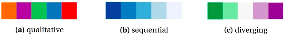
Figure 2: Color schemes
2.2.5 Interactivity
The success of an interactive display results from the appropriate interface complexity for a certain user motivation (Roth and Harrower 2008). In the field of interactive maps, (Roth and Harrower 2008) examines when cartographic interaction positively supports work. Interactivity is not always beneficial to the graphs, but relevant for users who wish to customize the communicated information to their particular interests, also relevant to overcome some display problematics. Interactivity also helps enhance the user’s involvement with the map, by offering a sense of control over the experience.
2.3 Overview of visualization tools
To put the above principles into practice, various tools are available to create data visualizations. A few important things to consider when choosing an appropriate tool are the features supported (user interactivity, spatial data, 3D, web), and also the price, speed, scalability, robustness, customizability and user adoption. Then, it is often a trade-off between customizability and ease of use. Such software is usually easier to utilize, and the resulting visualizations are often more aesthetic, but if the user is willing to code, custom scripts offer the most flexibility in design, and various charting libraries allow to tailor the figure to specific needs. This section does not pretend to be exhaustive but attempts to give an overview of the available data visualization tools, based on a review conducted in late 2016. Emphasis will be given on spatial data as it constitutes an essential part of natural capital information.
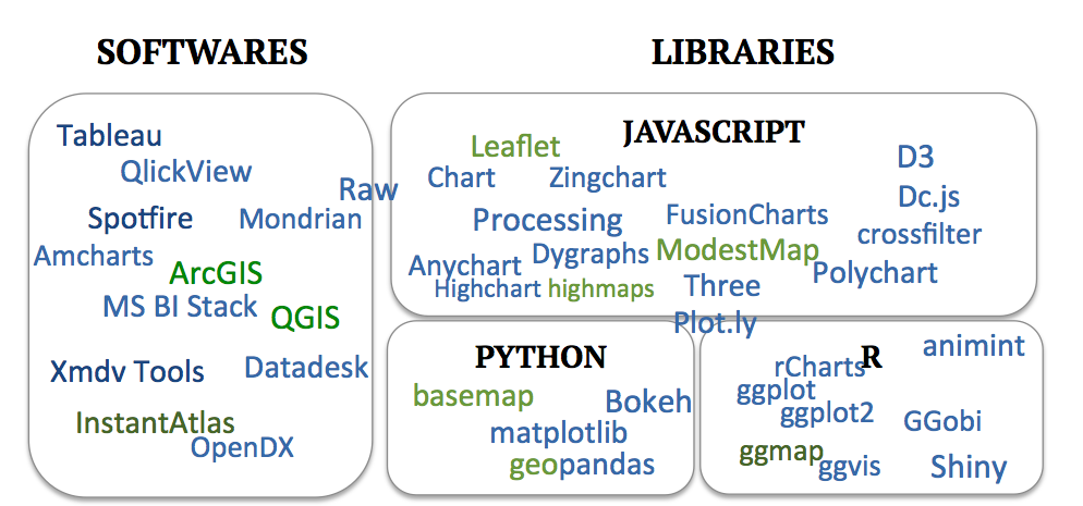
Figure 3: Overview of some existing visualization tools
2.3.1 Data analysis and visualization software
There is a myriad of data visualization software available, usually combining some analytics features. Some of the main ones are Tableau, Spotfire, Qlickview and MS BI Stack. Dynamic visualization has historically been supported by software like Xmdv Tool and OpenDX (both open source) and is recently proposed by many new software, as visual data analytics is becoming very trendy.
In terms of maps, some software support spatial data (namely Tableau, Spotfire and OpenDX). Moreover, GIS software are designed to build maps from any data and to perform spatial data analysis; ArcGIS and QGIS are the most common. The former integrates in its desktop version several applications, namely ArcMap to build maps, ArcCatalog for data management, ArcToolbox for geoprocessing, and also ArcScene, ArcGlobe, and ArcGIS Pro. QGIS (formerly Quantum GIS) is the corresponding open-source software. According to synthesis of users’ forums, it seems that ArcGIS seems to have more functionalities, especially when dealing with rasters and better support tools, and QGIS a steeper learning curve. However, they are really comparable. To combine spatial data and dynamic displays, some software such as InstantAtlas provide interactive mapping services. More details and examples of geovisualization tools are presented by Buczkowski (2016) and include Carto, the Mapzen API, Maps4news, as well as Tableau, mentioned above.
2.3.2 Charting libraries
Charts and maps can also be generated through scripting, allowing greater flexibility. Sorted by programming languages, some of the main plotting and mapping libraries are listed below. On the spatial data side, Hügel (2015) advocates for these over GIS software for exploratory data analysis.
2.3.2.1 Javascript
Javascript is, without a doubt, the go-to language for fancy - and definitely for interactive - data visualization, considering the multiple charting libraries written in this language. The one that stands out is D3.js (or just D3 for Data-Driven Documents). Formerly Protovis, it produces dynamic, interactive and very customizable web visualizations. In the same vein, Processing, Anychart, FusionCharts, Dygraphs, Highchart, Zingchart, Three (3D) can be cited among others. Several tools build upon D3, the library Dc.js adds crossfiltering functionalities, such as brushing and linking, Raw provides a user interface to build D3 typical examples without having to code (Caviglia and al 2013). Also Plotly API libraries that build on D3.js not only for javascript but also with versions for Python, Matlab and R.
Leaflet is probably the most adopted mapping library for spatial data. Mapbox supports similar functionalities with the Mapbox GL library. Other mapping libraries include ModestMap (from the makers of Mapbox) and Highmaps.
2.3.2.2 R
R plotting packages ggplot and ggplot2 are very efficient for static visualizations. The map package built on top of the latter, ggmap combines spatial information from GoogleMaps, OpenStreetMap with the grammar of graphics of ggplot2 (Kahle and Wickham 2013). The interactive version of ggplot2 would be ggvis, however its dynamic functionalities are quite limited. A powerful package for interactive (web) visualizations is Shiny, it can be combined to Leaflet for spatial data. R spatial packages include sp, raster, maptools and rasterVis.5 Also, as mentioned above, Plotly has an R version too, converting ggplot2 charts to interactive ones. Another way to connect to the multiple javascript charting libraries is to use the package rCharts.
The OpenMORDM visualization toolkit (Hadka et al. 2015) is a dynamic visualization platform built from R Shiny. It allows to explore, gain insight on the data, and make static plots, with a focus on deep uncertainty and robustness visualizations.
2.3.2.3 Python
Matplotlib is the main Python graphing library. It contains a toolkit for plotting 2D data on maps: basemap6. Also, geopandas extends the data analysis library Pandas to spatial data, using also Fiona for file access, Shapely and Descartes for geometric operations, PySal for spatial analysis, and of course Matplotlib for plotting (Hügel 2015). Interactive plots are based on Bokeh which imitates D3, or, as mentioned previously, Plotly.
3 Design strategies to display natural capital information
This chapter gathers the knowledge acquired from an extended literature review on static and dynamic approaches to displaying complex data and existing strategies in use. This literature review explored the design strategies to express and visualize multi-dimensional, spatial, multi-objective, uncertain data and combinations of these. This focus corresponds to the specific challenges faced while communicating natural capital information. The variety of mapping and synthesizing approaches in the field of ES leads to difficult choices of methods for the analysts (Englund et al. 2017). So this practical toolbox aims to put together the various options, hopefully providing a clearer vision on the variety of visualization strategies.
An important preliminary note: plots and graphs are not always necessary. Sometimes, the full data table is the best visualization, particularly for small datasets where presenting the data alone could be sufficient. In some cases, visualization will lead to the desire to inspect the data, in which case presenting directly the data itself may be more efficient. For example, in the case of a mid-project intermediary report for a meeting with experts on the project, it is likely that plots will lead to questions digging in details, where showing the full dataset and how solutions were selected and compared to each other is necessary.
3.1 Multi-dimensional data
In the context of ES, multi-dimensionality arises often from multi-objective problems such as cases where multiple services are considered and their trade-offs are to be explored, but also from multiple scenarios, due for example to exploration of alternate development pathways. Visual decision support tools are very relevant in the field of multi-objective optimization problems7, as well as for scenario comparison. For multi-objective optimization under uncertainty, the number of scenario considered can be very large. In the typical cases, there is no unique optimal solution, but a collection of Pareto optimal ones (Hadka et al. 2015), i.e. solutions where improving the result towards one objective result a decrease in performance with regards to another objective (Pareto 1896). Efficient visualizations empower the user with the ability to navigate through thousands of potential solutions, compare them and understand trade-offs, leading to performant decision-making.
Multi-dimensional data visualization has been given considerable attention, as computational capacities have been increasing and the amount of produced data exploding. Multi-dimensional data exploration has taken several directions, based on geometric projection techniques, to which distortion and interaction techniques (discussed in sections sec:disto and sec:interactivefeatures) can be added to further improve these visualizations (Keim 2000). The curse of multi-dimensionality, as explained by Allen et al. (2012) is that graphical displays become less informative as the dimensions and complexity of datasets increase. However, she argues in favor of detailed graphs because their ability to show more data and reveal more information outweighs the drawbacks of this curse.
3.1.1 Scatterplots
The classic scatterplot displays data with two to three dimensions, using cartesian coordinates and two or three axes. In a 3D scatterplot (figure fig:hadkaa) solutions are represented as points in the space. Additional dimensions can be represented by changing attributes (color, shape, size, orientation, etc), however this may negatively impact clarity or risk ovewhelming key messages of the plot. Interactivity allows the user to perform selections of one or multiple point(s).
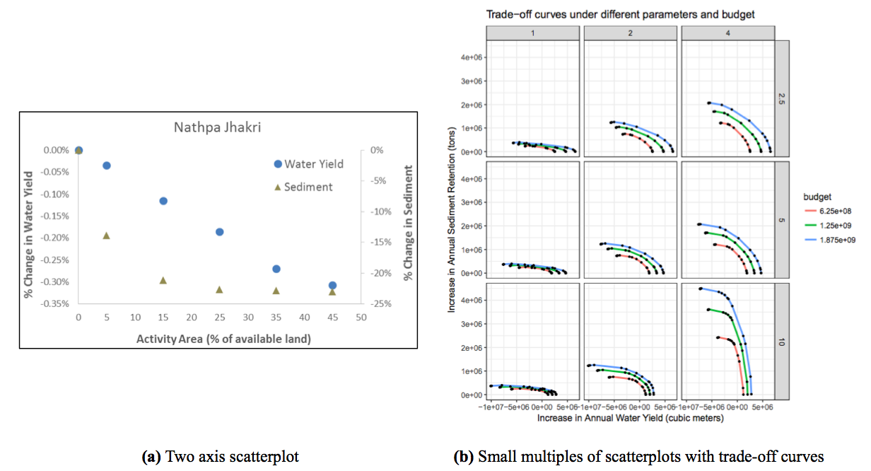
Figure 4: Several options to display multiple variables with scatterplots: (a) Two axis scatterplot (Vogl et al. 2014), (b) Small multiples of scatterplots with color coded trade off curves (Courtesy Benjamin Bryant). For trade-off curves example, see also figure fig:Peter.
In the context of multi-objective optimization, to understand trade-offs and synergies between several objectives under many scenarios, scatterplots are a great option. The commonly used trade-off curve is a scatterplot displaying objective scores, with an axis per objective, and a datapoint per scenario (see for example figures fig:Peter and fig:addlc). A third objective can be displayed by adding a colorscale or size-scale. Also, 3D scatterplots are often used for up to four objectives (e.g. in figure fig:hadka or the VIDEO software of Kollat and Reed (2007)). Over 4 objectives, small multiples of trade-off curves are very relevant.
When relationships between several variables are to be explored, scatter plot matrix (SPLOM) are suitable. They combines the small multiple strategy (further described in section sec:smallmultiples) with the classic scatterplot to display relationships between every pair of variables8.
3.1.2 Time-series data: line charts, streamgraphs and more
For data including several independent variables, and a dependent one, a line chart is a version of a scatterplot (see sec:scatterplots) where points are ordered (on the x-axis), and joined with segments. Line charts (also referred to as run charts for time-series data, or index charts when interactive) highlight relative changes, these are a good options when comparing the independent variables.
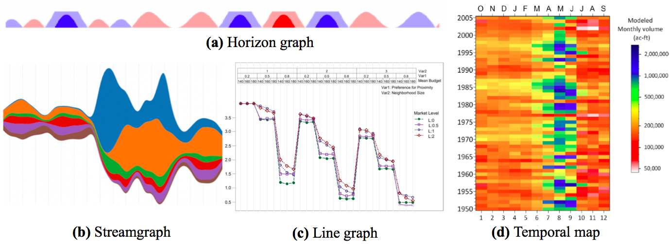
Figure 5: Illustrations of concepts of (a) horizon graphs (Heer et al. 2009), (b) streamgraph (Vallandingham n.d.), (c) line graph (Sun et al. 2014) and (d) temporal map (Koehler 2014). (c) comprehensive plotting example for a case of a 4-dimensions dataset plotted with four 3-dimensions figures to display $4*3^3$ data points. This is one of the 4 figures, where Sun et al. (2014) displays results of one of the 4 metrics as several line plots (for several variables, here one per market level), and varying parameters (here 3 parameters with 3 possible values each resulting in $3^3$ data points per market level, per figure.
Streamgraphs (figure fig:line_imgb), also called stacked graphs, sums visually the time-series values around a central axis by stacking area charts on top of each other (Heer et al. 2010). These work only for positive values, and provide general view of the data, but are not effective for visualizing details, also they are more efficient in interactive form than static (Ribecca n.d.). In the case of very large timeseries datasets, horizon graphs (figure fig:line_imga)is a very space-effective option, despite a certain learning time for the reader to understand the graph style. Horizon graphs consists in filled line charts, where negative values are mirrored (and colored typically in red) to appear on the upper side, and then the chart divided into bands that are overlayed using transparency effects to limit the space required for peaks. Thus the space used is divided by four thanks to these two transformations (Heer et al. 2009).
When the goal is to compare monthly values within and across multiple years, a fairly recent display solution has been suggested: temporal maps as shown in figure fig:line_imgd (Koehler 2014). An extension of this concept, for very high-dimensional datasets, is pixel-oriented visualization which consists in using each pixel to display one data value in highly structured arrangements (Keim 2000). Both are grids, displaying a value per cell, by a color. Other strategies extend these plots, for example multi-variate metrics can be visualized through comprehensive plotting (figure fig:line_imgc). Spatial metrics can also be visualized through histograms comparing main summary statistics in different scenarios (e.g. the percentage of land areas covered by each 3 category is displayed for 3 drivers, and 4 scenarios using small multiples histograms in figure 4 of the work of Villamor et al. (2014))9.
3.1.3 Parallel coordinates plot
Parallel coordinates plots (figure fig:hadkab) are very effective to display different solutions in a multi-objective context and visualize trade-offs and synergies between objectives under several scenarios. They make relationship and correlation patterns clearly visible (Achtert et al. 2013).

Figure 6: Four objectives visualization with (a) 3D scatterplot and colors and (b) parallel coordinate plot, achieved with the OpenMORDM open-source R library (Hadka et al. 2015)
The number of scenarios is then nearly unlimited, and so is the number of objectives, to the limit that the axis fit the page. Scenarios are represented as lines, distinguished by varying colors, which intersect horizontal axis representing the objectives. The vertical direction of preferred solution must be clearly indicated to assist interpretation.
Tradeoffs are illustrated by crossing lines. However, one limitation is that each axis having at most two neighboring axis, only N-1 relationships of $\binom{N}{2}$ combinations for an N-dimensional dataset can be visualized at once. This can be overcome by re-ordering the axis, possibly with an interactive tool, or by upgrading to a 3D parallel coordinate plot where the axis are still in parallel, but some appear closer (Achtert et al. 2013), although this approach is more difficult to interpret, which may explain why it is not widely used.
Combining parallel coordinates with interactive features offers interesting options to explore the data. For example, brushing allows to extract trends over subsets, furthermore (Andrienko and Andrienko 2001) recommend linking to other graphics. To contrast alternative options and explore the effects of trade-offs, Hadka et al. (2015) recommends adjacent 3D scatterplot and parallel coordinates plot,as shown in figure fig:hadka. The equivalent of parallel coordinates plot for categorical data is the alluvial plot; it is also useful to discretize the data into subsets when the dataset is too large for the lines to be distinguished, Trindade (2017) provides more details. Several tools and packages exist to make both parallel and alluvial plots10.
3.1.4 Radar charts
The radar chart, as shown in figure fig:coastal_sm, is the version of parallel coordinates plot in polar coordinates. It has also been referred to as spider chart11, web chart, star chart, polar chart, or Kiviat diagram. It can be an interesting way to visualize trade-offs. However, they tend to become cluttered and complicated if with many variables, making comparisons very difficult (Ribecca n.d.)12
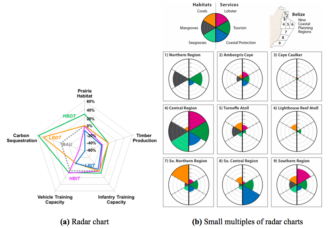
Figure 7: (a) Radar chart, in the context of a NatCap project in Kamehameha schools, Hawaii. (b) Small multiples strategy applied to radar charts by Arkema et al. (2015). The multiples correspond here to the 9 considered regions. The difference between these two types of radar charts must be noted: the latter (b) may be criticized and raise graphical integrity concerns, as it leads the reader to interpret on the area but the metric is scaled over the distance from center (doubling the distance out from the center quadruples the area, which could be misleading)
3.1.5 Small Multiples
An effective alternative to coercing all the data in a single plot (risking overplotting) is displaying small multiples. The concept is to replicate the same simple graph structure (in terms of axis, shape and scale), for many datasets, ordered logically. The cognitive process of understanding the graph is undertaken only once, and the understanding then is replicated while scanning all other multiples. This strategy is very efficient in many cases for comparison and broadly used. Referred by the data visualization expert Tufte (1983), as “multivariate and data bountiful”, they enforces comparisons of alternatives, differences and changes. This displaying strategy has also been called trellis chart, lattice chart, grid chart, or panel chart. It can be applied to many types of graphs, or maps. Other examples of the small multiple strategy and variants of it can be found in figures fig:arkemaaa, fig:coastal_smb, fig:addla.
3.1.6 Reduce dimensions
Another approach to reduce cognitive complexity of multi-dimensional data, is to reduce the dimensions in some coherent way. For example, the principal components analysis (PCA) can be conducted to reduce the number of variables by combining the correlated ones (Hotelling 1933). Similarly, the choice modeler approach aims to evaluate multiple decision variants, in a very large decision space. The concept is to identify criteria that do not influence the output (here, the decision option ranking), and remove these dimensions, to simplify without losing correctness (Jankowski et al. 2008).
In the same vein, multiple dimensions can be summarized by creating an aggregated metric, e.g. an indication of a lake recreation value would combine variables such as water quality, lake size, boat options (Ryan Noe, personal communication). The basic concept to get this aggregated value is to sum each dimension once all have been put into comparable units and weighted according to preference.
3.1.7 Multiple linked views
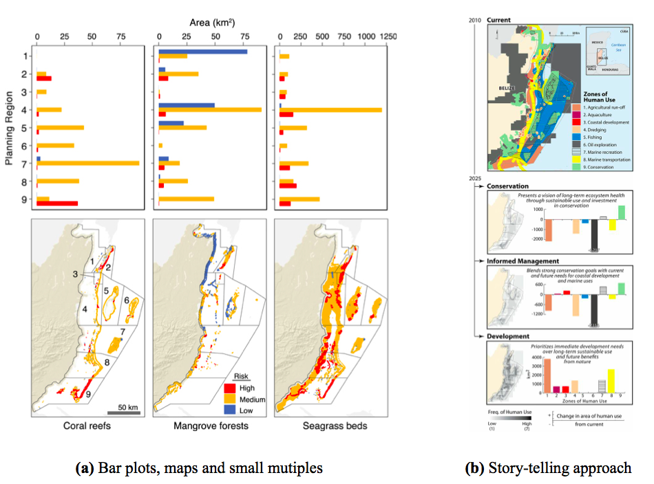
Figure 8: Examples of combining static plots: (a) the bar plots display the area of habitat in each risk category (low, medium, high) per planning region (1 to 9), by Arkema et al. (2014). (b) Dense figure using a story-telling approach to present scenarios. It combines bar plots, maps and the small multiples approach. This figure is self-explanatory, and by including a few sentences, it replaces several paragraphs (Arkema et al. 2015)
Several options to display multi-variate data were discussed above. However they all realistically apply to a limited number of variables. As dimensions of the data increase, it is often interesting to show several linked graphs of the same dataset to convey the complex information. This solution gives different perspectives to the viewer. In the case of a static display, the graphs are connected by matching color coding or other corresponding parameters, as in figures fig:hadka, fig:arkemaaa, fig:arkemaab and fig:addlc.
Furthermore, dynamic displays allow improvement by adding brushing and linking features (see sec:interactivefeatures), examples of interactive dashboards with multiple linked views include (click on the title to be directed to the online version):
- The Middle Cedar visualization (figure fig:Peter)
- The Conservation ROI Dashboard (figure fig:ConservationROIDashboard)
- Habitat Risk Assessment Dashboard. This interactive web application displays user’s InVEST output workspace, and was developped in R and Javascript.
- Tana Water Fund Spatial Optimization Results Dashboard (prototype) (figure fig:webapp_full)
- Coastal Vulnerability Dashboard
3.2 Spatial data
3.2.1 General classification of maps
3.2.1.1 Choropleth maps and proportional symbol maps
Choropleth maps (see figure fig:typesofmapsa) are very effective and widely used to display a continuous or categorical spatial variable aggregated by regions. The variable of interest is expressed by coloring (or using patterns on) these geographical areas. Particular attention needs to be given to the choice of patterns (see section sec:colors). Furthermore, it may be necessary to normalize13 raw data values to ensure graphical integrity (Heer et al. 2010). The main drawback of choropleth maps is that larger areas appear emphasised (Ribecca n.d.).
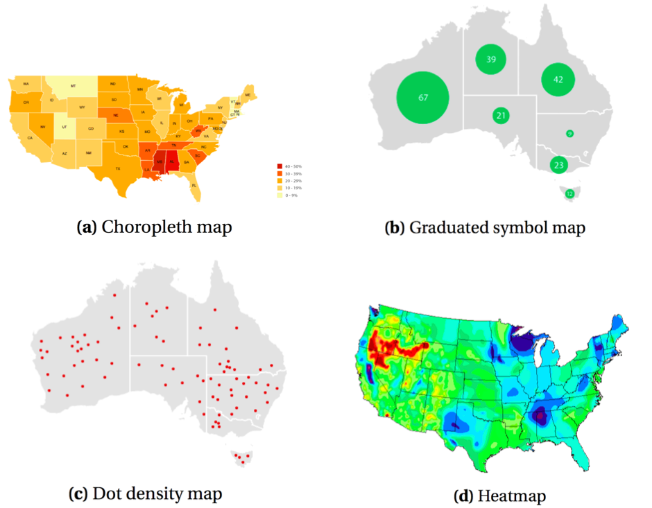
Figure 9: Main types of maps (source: the data visualization catalogue)
Another solution for continuous spatial data aggregated by regions is the graduated symbol map (or proportional symbol map, also called bubble map (Ribecca n.d.)) that overlays symbols to the base map. In this case, the underlying area does not affect the perception of the variable considered (Heer et al. 2010). These two approaches can also be combined, allowing to express more than one variable.
3.2.1.2 Heatmaps and dot density maps
Displaying density of occurrence, and identifying clusters can be achieved with heatmaps and hotspot maps. The heatmap can be understood as the continuous version of the choropleth map, without aggregation of the data. It visualizes a scalar function over a geographical area (Brodlie et al. 2012). Similarly, in the dot distribution map (or dot density map), the density of dots represents the intensity of the variable. The dots are randomly placed, which may be misleading if unclear to the viewer. Figure fig:typesofmaps illustrates these.
3.2.1.3 Contour maps
Also know by contour maps or isarithmic maps, isopleth maps display a variable with contour lines (isopleths) joining the points where the variable has a constant value. For example in the field of ecology, isoflors are isopleths connecting areas of comparable biological diversity (Specht 1981). Color fills may be used to enhance the map pattern. Contouring can also be used to highlight areas on a map, as in figure fig:myanmar_biodiv-pplb), which combines information about two independent variables, overlaying two types of maps.
3.2.1.4 Cartograms
Cartogram also illustrate data aggregated over regions. The variable to be expressed is substituted to the geographical distance or area. The regions are in the same locations with respect to each other, but their geometry is distorted in proportion to the variable of interest (Heer et al. 2010)
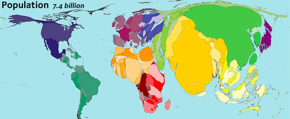
Figure 10: Cartogram displaying population (variable) per country (regions of aggregation) (Hennig 2011)
3.2.1.5 Flow maps
A flow map illustrates movement in space and/or in time. The intensity of a flow is represented by the thickness of the line depicting it (Ribecca n.d.). Flow maps are commonly used to visualize migrations of animals, but can also be applied to pollution load transfer, or groundwater movement from one zone to another.
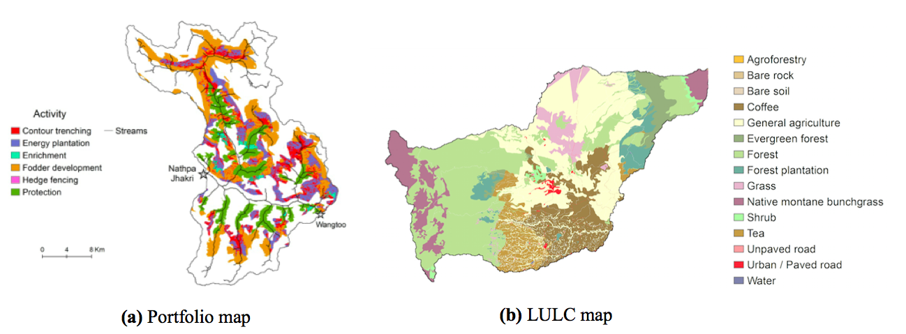
Figure 11: Portfolio and land cover maps: (a) a portfolio map of the Nathpa Jhakri catchment (Vogl et al. 2014) and (b) a many-classes LULC color scheme (Courtesy Stacie Wolny)
3.2.2.2 Objective score maps
Objective score maps are choropleths with the area of aggregation being generally at the level of the spatial decision unit (which may be a pixel or polygon). These are widely used to visualize ES model outputs. Sometimes, the objective score maps of different ES objectives are combined in a single one summarizing the overall scores (e.g figure 10 in Wada et al. (2017, in review)).
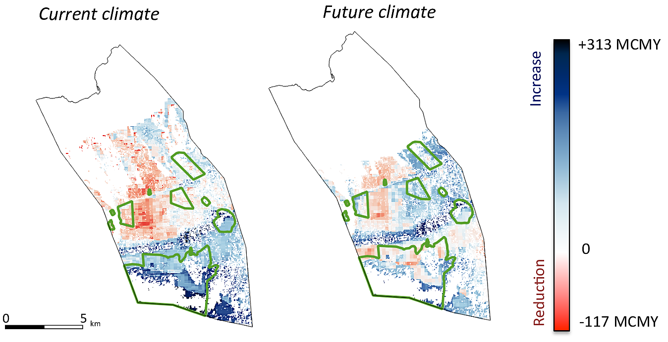
Figure 12: Marginal objective score map showing th impact of restoration on groundwater recharge in Pu‘u Wa‘awa‘a. The green contours overlayed outline the enclosure areas (Wada et al. 2017, in review)
Objective score maps can display either absolute scores, or the change in score relative to a baseline, in which case they are also referred to as marginal value maps. They are basically change maps of two objective score maps, figure fig:hawaii2 is an example of marginal objective score maps.
A variant of these are the activity score maps, which display the objective score specific to an intervention, by decision unit. They detail the impact of an intervention on a specific ES metric, and therefore help answer questions like: Where in space does a given intervention or scenario improve or worsen a specific ES metric? Where does an activity contribute to objectives?, which the usual objective score maps, looking at the overall change in ES, fails to address. The concept of activity score maps is detailed in figure 6 of Vogl et al. (2016).
3.2.3 Spatial visualization of tradeoffs
In the context of spatial targeting of interventions, ES analysts often have to figure out where, on a landscape, do activities produce co-benefits, and where are they in conflict. That is: where does an intervention move multiple ES metrics (objectives) in the same direction to produce win-wins locations? And on the other hand, where in space is a given intervention contributing to some metrics at the expense of others?
Hotspot map
In the case of only 2 scenarios or only 2 objectives, one could show change maps, or side by side maps, i.e. techniques used to compare 2 maps, detailed in sec:comp_map_2. For more objectives or scenarios, hotspot maps (figure fig:Stacie20a) can display location of synergies/tradeoffs of intervention/scenario on multiple ES metrics. The idea of the hotspot map is to select the areas of highest score, for each objective, and find areas of overlaps. For example, as shown in figure fig:Stacie20a, the top 20% of each service are selected, the selection are then added to construct the hotspot map. The categorical version of a hotspot map details priority/conflicts zones for each objective, as in figure fig:Stacie20b. This one may appear less intuitive, mostly because of the qualitative colorscale, but is more detailed: one can see precisely which objectives are in conflict.
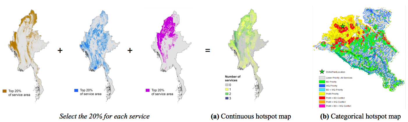
Figure 13: (a) Hotspot map in Myanmar for 3 objectives (Wolny, 2016) and (b) Categorical version of a hotspot map: Priority and conflicts areas, in the case of 3 objectives: biodiversity (BD), water quality (WQ) and profit. Thanks to this map, the decision-maker can decide where to intervene on the landscape, depending on which objective(s) (s)he prioritizes (Bryant and Hawthorne n.d.)
A remaining subquestion is about the intensity of tradeoffs and synergies in space: where are tradeoffs more or less stark? An extension of figure fig:Stacie20b could be envisioned, varying transparency to represent intensity, or using a diverging color scheme (figure fig:colorschemesc)to convey both intensity and direction of agreement/disagreement Fig 3.1c].
Another strategy consists in combining trade-off curves with small multiples of objective score maps. On trade-offs curves (see section sec:scatterplots), each point corresponds to a portfolio: displaying these together greatly enhances user understanding. Examples of strategies to display together the trade-off curve and the corresponding maps are presented in figures fig:addlc and fig:Peter.
3.2.4 Relationship between variables
Expressing relationships between independent or correlated variables is often needed when dealing with several objectives or metrics. For example, it is very relevant in the context of displaying the beneficiaries of a project. This topics seems to trigger growing interest (Weil 2017). However, this tasks appears to be very context specific. Typically, the displays would aim to quantify and show the impact on beneficiaries, possibly by subgroups, defined based on demographics or their location. It is also often of interest to contrast beneficiary distribution in space with service distribution in space. For example, figure fig:myanmar_biodiv-pplb highlights the relationship between people’s dependency on forests and the location of key biodiversity areas (KBAs).
3.2.4.1 Relationship between independent variables
Two variables can be expressed at once by combining two maps. Figure fig:mycombinea shows only the resulting map, while figure fig:mycombineb displays side by side the two input map and the one combining these, a more self-explanatory but also space-consuming approach.
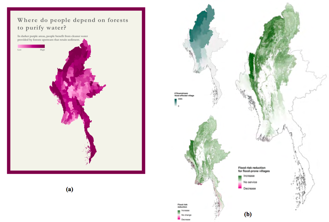
Figure 14: Examples of combining two maps by multiplying them, in Myanmar (Mandle et al. 2016). (a) Combining ES maps with population maps to show people’s dependency to ES. This map results from the multiplication of (1) an objective score map for sediment retention, and (2) a map of the number of people who use surface water for drinking, as provided by the national census (b) the top small map displays the number of villages located downstream from regions affected by the flood, the bottom small one indicates how much the natural vegetation contributes to reducing flood risk. The third map results from the multiplication of the two others, and therefore displays the flood risk reduction provided by natural vegetation that benefits the most villages downstream. Displaying these 3 maps on the same page within eyespan facilitates understanding (here, there are squeezed for purposes of space efficiency, but are originally displayed side by side)
3.2.4.2 Spatial correlation
Spatial correlation can be expressed by displaying correlation statistics computed for corresponding pixels (as in figure fig:myanmar_biodiv-ppla displaying correlation coefficients) or by overlaying different maps (as in figure fig:myanmar_biodiv-pplb)
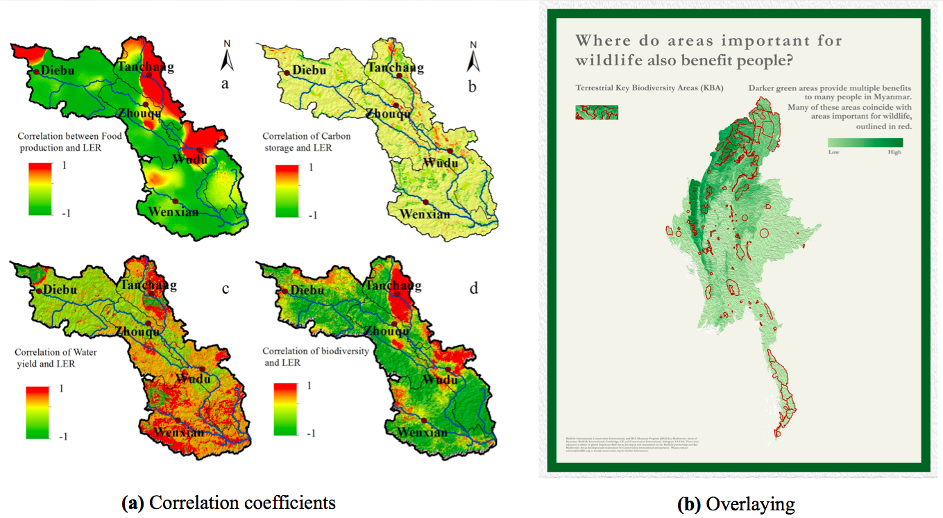
Figure 15: Expressing spatial correlation (a) through displaying spatial correlation coefficients between two variables. Here,between each ES considered and the landscape ecological risk (LER) (Gong et al. 2016) (b) Overlaying variables: combining information about biodiversity (contour maps in red showing the key biodiversity areas) and about ES benefits (choropleth map with green gradient), overlayed on a relief map (Mandle et al. 2016)
3.2.4.3 Interactive maps
Interactive maps allow one to overlay multiple layers corresponding to multiple variables, allowing to explore relationship between different variables/layers. Good examples include:
- Myanmar Natural Capital: a storytelling approach for a project involving multiple ecosystem services. The tools used here are D3.js, leaflet, openStreetMaps, Google Maps and photoshop.
- The Nature Conservancy also developed a visualization platform, gathering a suite of web applications based on maps, aiming to convey and/or simplify ecological concepts, assess risk, identify and compare different solutions and scenarios. For example, the coastal resilience interactive map in the Gulf of Mexico.
- The Mapping portal for the Belize project by Gregg Verutes, developped with Mapbox, and OpenStreetMap and a similar map web viewer from the same author, for coastal hazard model results in the Bahamas.
3.3 Comparison of multiple spatial runs
Runs refers here to different versions of a spatially explicit variable; this section is about comparing multiple maps expressing the same variable - while comparison of maps expressing different variables was treated in sections sec:hotspot and sec:beneficiaries. This multiplicity of outputs may correspond to multiple scenarios, objectives or varying parameters values (i.e. sensitivity analysis, this case is further described in section sec:SA). Summarizing these multiple spatial model outputs is necessary in applications such as:
- portfolios comparison, to understand trends in agreement and disagreement on recommended action, in contexts of land use change planning or spatial targeting.
- comparison of ES model outputs such as objective scores at pixel or polygon level, to understand similarity and differences between maps of several ES objectives under one scenario, or the maps of same objective under several scenarios. Many maps are often generated under many combinations of scenarios or parametric uncertainty. Relevant examples also include comparing objective score maps associated with many points on an optimization frontier.
Comparison and summaries of spatial data can be achieved either by visualizing spatially as maps (see sec:comp_map) or through quantitative indices and metrics synthesizing the results aspatially (see sec:metricsmultrunscat for categorical data summary indices, sec:metricsmultrunscont for continuous data).
Map comparison tools
Automated comparison of maps can be achieved with software like the* Map Comparison Kit16 (Visser and De Nijs 2006). An algorithm calledMapcurves, implemented in R and Matlab, provides a goodness-of-fit measure based on spatial overlap.TerrSet* software also provdes GIS analysis features, including multiple map comparison and a variety of spatial statistics (ClarkLabs 2015). The R packages raster and lulcc also provide basic statistical functionality like Moran’s I, and multi-resolution analysis (see Pontius and Millones (2011) for the last).
3.3.1 Map displays
3.3.1.1 Between two maps
Interactive switching between maps
For the examination of (dis)agreement between two maps, analysts often like to flip back and forth between the two (from survey results). This is easy to do in GIS software and is a convenient solution for the data exploration purposes. Nevertheless, this method is not always suited for communication purposes. Plus, this interactive solution doesn’t apply to static documents.
Side by side maps
A classic static option consists in showing the two maps next to each other. This is not the most space effective option, but allows an intuitive understanding and facilitates comparison. The two maps must be within eyespan (avoid page breaks).
Change map
Subtracting one map to the other (the other generally corresponding to the baseline scenario) results in a change map. Typically change maps use diverging color schemes, with two colors representing increase and decrease, and the intensity gradient reflects the amount of change. These are suited for scenario comparison with a baseline scenario, or how two future scenarios differ from each other. An example can be found in additional figure fig:addlb.
3.3.1.2 Between many maps
The problem complicates when comparing many runs. In the context of multiple continuous ES model outputs, such as objective score maps for several ES services, a hotspot map can be constructed (detailed in section sec:hotspot) but is limited to few objectives. Other strategies are suggested below.
Maps matrix (small multiples strategy)
When the number of maps to compare is low enough to fit in a page, with a reasonable resolution, the small multiple approach (see section sec:smallmultiples) is relevant, as in figure fig:addla.
Footprint map
To express the the extent of where interventions might be considered, footprint maps show which areas have been selected as part of any portfolio under consideration. Pixels are assigned a binary value (1 if the pixel was selected in any portfolio for any intervention, 0 otherwise). To express agreement about an activity across portfolios, footprint maps can also be done for a specific category (1 is assigned is the pixel was selected in this category).
Modal portfolio and frequency map
For categorical data, the frequency map approach would display the frequency with which the modal category is assigned to each unit across runs; the modal category being defined according to the context, typically the most assigned category to each area across (Bryant et al. 2015). In the context of portfolios, this is called the modal portfolio, displaying the most often chosen activity for each spatial unit17. The comparison part is held by the frequency map, which express how often was the activity chosen. Precisely, the frequency map is usually constructed as such: for each spatial unit, number of portfolios where the modal value is chosen divided by total number of portfolios. These two maps complement each other: the modal portfolio is about summarizing when the frequency map associated hold indications on comparison. They can be overlayed or displayed side by side, as in fig:RIOS.
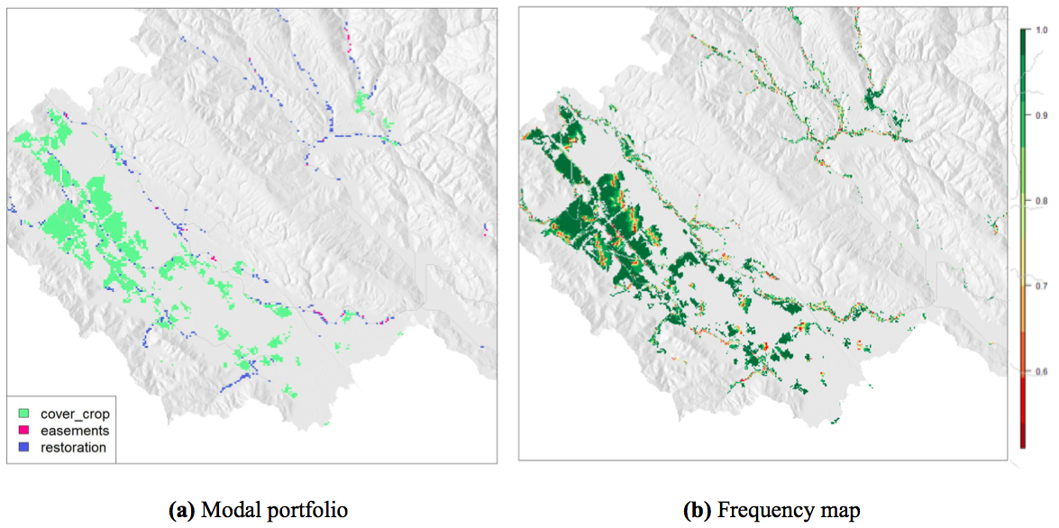
Figure 16: Example for a set of 57 runs, over a subwatershed, modified from Bryant et al. (2015). In the frequency map (b), the prevalence of dark green indicates that most activities are quite robust.
Categorical map diversity indices
An alternative to frequency maps, to summarize the categorical variance across many runs is to use a diversity index, such as the Shannon diversity index: for each pixel $SDI = - \sum_{i=1}^{R} p_{i} \ln(p_{i})$, with $\textrm{p}_{i}$ the proportion of cells assigned to category i, and $R$ the total number of categories. How to interpret the SDI: when evenly distributed, $SDI = \ln(R)$, and as it approaches $0$, proportions in each category vary more. Hence, SDI reflects the relative abundance of each category across the pixel stack. So, the smaller the SDI, the more confident one can be about the pixel’s most chosen category. Other diversity indices can also be substituted, such as the Evenness index, see the work of Kitsiou and Karydis (2000) for details.
The fuzzy set approach (Hagen 2003) assesses the similarity of several categorical maps, resulting in a fuzzy set comparison map where each cell displays a degree of similarity and an overall value for similarity, so-called $\kappa$-Fuzzy as it extends the Kappa index including fuzziness of category and of location.
Similarly, a coefficient of unlikeability measure variability in categorical data by considering how often, not how much, observations differ (Kader and Perry 2007). Calculated for each cell. It should be interpreted as such: the coefficient is high if different interventions were chosen (i.e. low agreement), and low if the same intervention tended to be chosen (high agreement). So it reflects (the inverse of) agreement across maps.
Variant-invariant method
In the same vein, the variant-invariant method aims to distinguish the invariant regions, that is the areas where the category assigned is consistently the same (see Brown et al. (2005)).
Spaghetti plots
Visualizing flow data, spaghetti plots (figure fig:spag3Da) express consistency between runs. Widely used in meteorology, the consistency of the runs is expressed by how tightly clustered they appear. Spaghetti plots may be translated to continuous spatial data by using the isocontour of each run, which is useful when concerned about a specific threshold.
3D plots overlaying maps
For continuous data, 3D plots overlaying maps (figure fig:spag3Db) have been used to highlight structural differences across maps. However, this solution seems limited to relatively small regions, and clearly distinguishable distributions of the variables expressed through color and height of the histogram.
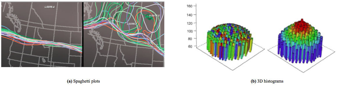
Figure 17: (a) Spaghetti plots displaying ensemble datasets (Wilson and Potter 2009). The spaghetti plot is the isocontour of each run. If the runs agree (Fig. left), it will result in a coherent bundle. Slight disagrements induce divergence from the main bundle (Fig. right). (b) 3D histograms, organized according the geographical layout; extract from figure 8 of Huang et al. (2013)
Interactive map comparisons
Animation is of great interest in this context. Dynamic visualizations are very suited for displaying multiple spatial outputs, there are increasingly used to display results in the field of ABMs[^1back], encountering similar type of outputs (Lee et al. 2015).
[^1back]: Agent-based modeling (ABM), or indivisual-based modeling consist in representing phenomenas as dynamical systems of interacting agents, where an agent is a discrete and autonomous entity. Their individual behaviors are encoded, resulting in outputs describing the the agents’ interactions that are used to describe complex systems. These systems can be a variety of processes, phenomena, and situations in any field. (Rand 2015) In the context of this work, ABM is of interest because simulation runs often produce a high volume of multidimensional output data (e.g. induced by Monte Carlo sampling), requiring visualization and statistical analysis of the outputs.
3.3.2 Aspatial metrics to summarize results and agreements of categorical maps
Visual comparisons of maps is efficient and not too intense cognitively for human perception. However, it fails to rank quantitatively the results, nor is adapted to an important number of maps. Screening through hundreds of maps produced is not a viable option. Therefore, other solutions must be considered. In particular, a variety of non-spatial statistics can be used to summarize results and agreement over maps of the same area. The quantitative indices presented in this section and the next one (sec:metricsmultrunscont for continuous data) are suited for the purposes of summarizing results across many maps. This list is not exhaustive but aims to give an overview of this broad topic.
3.3.2.1 Between two maps
There are different types of categorical (i.e. discrete attributes) map consistency measures (Kuhnert et al. 2005):
Total per categories
The coarsest approach would be to compare the total numbers of cells18 assigned to each category, neglecting any spatial patterns. This gives a very general quantitative overview of the total per categories, that can be delivered as tabular data. (All the other, finer approaches detailed below imply a cell-by-cell comparison.)
Percent agreement
A basic cell-by-cell comparison method measures simply the overall agreement (or percent agreement) by calculating the portion of cells that agree between two maps:
(Cell-by-cell level of agreement) = (Number of direct matched cells between 2 maps) / (Total number of cells in map)
Kappa index of agreement
KIA or Cohen’s $\kappa$ is a widely used statistic measuring concordance between categorical items. This technique has proven efficient for cell-by-cell comparisons of spatial data (Manson 2005), as long as patterns and locations of changes are not involved (Kuhnert et al. 2005). It is more robust than a percent agreement because it takes into account the agreement occurring by chance. $\kappa = \frac{\textrm{p}_{0}-\textrm{p}_\textrm{e}}{1-\textrm{p}_\textrm{e}}$ with $\textrm{p}_{0}$ being the proportion of units agreeing, and $\textrm{p}_\textrm{e}$ the proportion of units expected to agree by chance (i.e. the hypothetical probability of chance agreement). Complete agreement results in $\kappa = 1$ (Cohen 1960).
However, after publishing his work about $\kappa$, Pontius (2000) later reconsidered his positions and advocated against the use of this index because of several flaws, mainly the irrelevance of the randomness baseline in many applications, and the fact that the ratio is difficult to interpret and overly complicated, as only the numerator actually matters (Pontius and Millones 2011). Instead, he suggests to use quantity disagreement and allocation disagreement measures (see next point).
Quantity & location fit
A more precise version of the $\kappa$ approach explained above consists in analyzing 2 metrics, measuring respectively the quantity disagreement and allocation disagreement. These are more helpful to understand both components of disagreement than with a single statistic of agreement. (Pontius and Millones 2011). For example:
- The quantity fit informs on the number of cells that changed from one category to another, offering an overall comparison on the quantity of each category: $$Quantity \ fit = 1 - \frac{1}{N}\sum \left | \textrm{a}_\textrm{1i} - \textrm{a}_\textrm{2i} \right |$$ where $\textrm{a}_\textrm{ki}$ is the number of cells assigned to category $i$, in map $k$ with $k \subseteq (1,2)$, $N$ the total number of cells in map and $C$ means all categories (Kuhnert et al. 2005).
- The location fit informs on the number of cells that kept the category but changed location from one map to another: $Quantity \ fit = (Location \ fit) \ - \ (Cell-by-cell\ level\ of\ agreement)$ Another possible way of measuring the location disagreement is the distance between the locations of matching cells in the maps can also be calculated (Kuhnert et al. 2005). An overall measure of distance between two discrete maps expresses the amount of agreement or the goodness of fit (Seppelt and Voinov 2003) and (Costanza 1989).
Jaccard index
Other indices comparing agreement across categorical datasets exist. However, very few to no applications in comparing maps has been found. The Jaccard index, also known as Tanimoto index, is computed as the ratio of the intersection of the two sets over their union: $$Jaccard\ index = \frac{Map1 \cap Map2}{Map1 \cup Map2}$$ (Van Rijsbergen 1979). Simple to understand, it ranges from 0 to 1, increasing with increasing similarity between the sets. The Sørensen-Dice coefficient is a slightly different version of the Jaccard index. Also called the Dice similarity coefficient , or F1 score, it is calculated as such: $$Sorensen-Dice\ index={\frac {2|Map1\cap Map2|}{|Map1|+|Map2|}}$$ More similarity measures for categorical data have been explored by Lourenco (Lourenco et al. 2004).
3.3.2.2 Between many maps
When comparing a large number of maps, aggregation often is necessary to communicate results (Brown et al. 2005). Some of the metrics detailed above that calculate correlation between two maps may be extended to many maps comparison (Seppelt and Voinov 2003), like the total per categories approach:
Total per categories
Calculating the total numbers of pixels assigned to each category (as in previous section) resulting in a table, with categories in comuns and runs in rows, which works if there are not too many runs. If there are, one may display a simple table linking categories with summary statistics indicating some measure of the mean and the variance (e.g. average and extrema or standard deviation), as exemplified in the table below19. However, this measure only accounts for the overall amount of each category, and not for spatial distribution.
| Land cover | Grass | Forest | Barren |
|---|---|---|---|
| Average pixels [min;max] | 121 [110;143] | 204 [158;226] | 25 [14;50] |
| Average percentage ± standard deviation | 35% ± 2% | 58% ± 3% | 7% ± 3% |
Cell stack methods
Finer methods imply to make calculations for each cell, in all the considered maps (as in, superposing all maps, and making calculation for the column of corresponding cells). For raster data, this technique of column of cells is referred to as pixel stack, raster stack, cell stacks, z-profile or vector of values. To summarize agreement between runs in a single number, the measures suggested in sec:comp_map_many can be aggregated. For example, the average SDI would give an indication of the consistency of the runs. However, these overall average do not give any indications on spatial patterns.
Comparison of landscape metrics
Some spatial metrics allow a user to identify and account for spatial patterns. They allow tabular comparisons of some runs (the indices are calculated for each run). They include Area-weighted mean shape index, centrality indices, contagion index (Lee et al. 2015). Some are more specific landscape metrics, such as the average core area, which is the proportion of production land per land cover category (Parker and Meretsky 2004), and the average patch perimeter-area ratio (PA-1) (Ritters et al. 1995). Landscape statistics measuring sprawl and fragmentation include landscape shape index (LSI), aggregation index (AI) contiguity index (CI) and centrality index (CTI). Together, they allow for comparison of landscape, spatial patterns of change and overall spread (Sun et al. 2014). More details on landscape metrics can be found in section 4.16 of Lee et al. (2015), among other references previously stated.
3.3.3 Influence of scale in map comparison and taking patterns into account
Spatial patterns may be interesting because solely computing the number of cell-to-cell matches is not reliable in all circumstances, as if there is a matching cell right nearby, it will not be taken into account (e.g. if we compare two chessboards shifted by one square, the number of cell-to-cell matches is null although there is evident similarity not to be ignored) (Kuhnert et al. 2005). The moving window algorithm addresses this issue and accounts for landscape patterns by considering neighboring cells in addition to the cell-to-cell comparison (Kuhnert et al. 2005). In the same vein, the ECE method (edge correlated error) also accounts for edge effect (Dean 2005).
Another strategy to address the same concern of accounting for arrangement similarity, instead of moving a “window”, is to vary the resolution considered. The hierarchical fuzzy pattern matching avoids drawbacks of a cell-by-cell comparison by aggregating the regional unit considered in patches, and conducting comparisons at different scales (Power et al. 2001). More suggestions can be found in the work of Remmel and Csillag (2006) who compare maps at different resolution to find hierarchical nested patterns, and of Dean (2005) who suggests to compare quadtrees (a hierarchical structure form of representing raster data) at different scales, resulting in the Quadtree-Based Arrangement Similarity (QBAS) index.
The influence of scale and the consistency of spatial patterns in pixel data, at coarser resolution are questions of interest in the context of natural capital. Pontius explores the influence of resolution in map comparison (Pontius, 2008 and 2011), by conducting comparisons at multiple scales. He notes that the format of the data (the resolution considered) impacts tremendously the results which sometimes are more due to this format, than the underlying landscape patterns. One of his ideas is to plot a total measure of difference (e.g. a sum of mean squares of a cell-to-cell comparison) at different resolutions: this plot gives an idea of allocation error relative to mean error and how the allocation error decays with distance. Remmel and Csillag (2006), Power et al. (2001) and Dean (2005) also point out the scale effects while attempting to take into account patterns, spatial shapes and arrangements in map comparisons. There is not yet a clearly adopted methodology to account for scale in ES spatial data analysis, and this topic could benefit from further research. For example, in the context of water-related ES, one may be interested into taking the hydrology of the landscape into account.
However, these methods are relevant only to categorical data, and little information has been found about the influence of scale for continuous maps, that are about to be discussed in the following section.
3.3.4 Aspatial metrics to summarize results and agreements of continuous maps
One handy strategy to handling continuous data is simply to discretize it, by sorting the dataset into categories corresponding to ranges of values. This allow to use all the metrics discussed above (section sec:metricsmultrunscat) for comparison. However, the arbitrary classification will impact the results. For a reliable metric, it is therefore necessary to do several different classification (i.e. discretize the dataset with different limits/size of categories). This approach, in the fields of statistics and image processing, has been referred to as binning, defined as grouping continuous values into bins, as implemented in many software packages (e.g. R documentation).
3.3.4.1 Between 2 maps
Aggregation of cell’s values: sum or mean
Each map can be summarized with a value aggregating cell’s values. For example, for an objective score map, the overall objective score of the map is the sum of the pixel’s scores. The average could also be used to aggregate. Once each map has an aggregated “summary value”, these can be subtracted to reflect the numerical difference in ES between 2 scenarios.
Spatial correlation indices
Statistical indices like the Bivariate Moran’s I or LISA (Local indicators of spatial association) aim to measure spatial autocorrelation between 2 variables in a same location (Matkan et al. 2013), which can correspond to two runs of the same variable. The field of spatial statistics digs more into these metrics.
Non spatial metrics
Other non-spatial correlation coefficients also can be applied to summarize spatial data, though care must be taken to avoid improper interpretations of statistical tests. An example is the Pearson linear correlation: $$\rho _{X,Y}={\frac {\operatorname {cov} (X,Y)}{\sigma _{X}\sigma _{Y}}}$$ It ranges from -1 (negative linear correlation) to +1 (positive linear correlation), and 0 corresponds to maps not correlated, or its variant, the reflective correlation.
Other standard statistical tests and summary statistics, not specific to spatial data, can also be used to summarize variance. For example, disagreement between two maps can be summarized by their variance, i.e. the normalized average of corresponding cell’s squared difference: $$\sum_{cells} (v_1 - v_2)^2$$ where $v_1, v_2$ would be the same cell’s value in $Map_1, Map_2$, possibly weighted by the relative importance of the cell (for example, the population if displaying results related to beneficiaries). This is just an idea, however, references to a least squares method have been found in literature, referring to it as a conventional approach, which would be to compute the least square on the plotted points (Pontius, 2008).
3.3.4.2 Between many maps
Besides discretizing the data and then using methods from sec:comp_stat_cat_many, a solution would be an aggregation of aggregated map values: summary statistics on map-wide statistics. As mentioned above, each map can be summarized with a value aggregating cell’s values. For example, for an objective score map, the overall objective score of the map is the sum of the pixel’s scores. A second aggregation can follow: for example, the mean or range of these overall objective scores provide second order statistics on the collection of maps (e.g. it will give an indication of average total objective score of scenarios), and one can also compare distributions of different subsets of maps.
Measures of dispersion are also interesting in this context, especially when comparing across two populations of maps (e.g. one set generated under the assumption of a climate change scenario, another set under a different assumption).
3.4 Uncertainty
“Finding ways to accurately and effectively represent uncertainty is one of the most important challenges in data visualization today. And it’s important to know that visualizing uncertainty in general is extremely difficult to do.”
Torres (2016)
3.4.1 Introduction to uncertainty & sensitivity analysis visualization
It is often of interest to analysts to consider how input uncertainty and model structure affect the precision and robustness of findings. Uncertainty may arise from modeling choices, parameters (see in particular section sec:SA) or future scenarios (e.g. future climate conditions). The inclusion of uncertainty estimates improves decision making (Reichert and Borsuk (2005) and Beven (2006) among others). Because ecosystem services depends on unique landscape characteristics, each case is unique and different procedures can be specifically chosen to generate summaries of robustness and sensitivity (Ligmann-Zielinska et al. 2014). However, uncertainty is often just ignored in the representation because it is challenging to visualize (Torres 2016). Conveying both statistical and data uncertainties is nevertheless essential to a thorough communication of results.
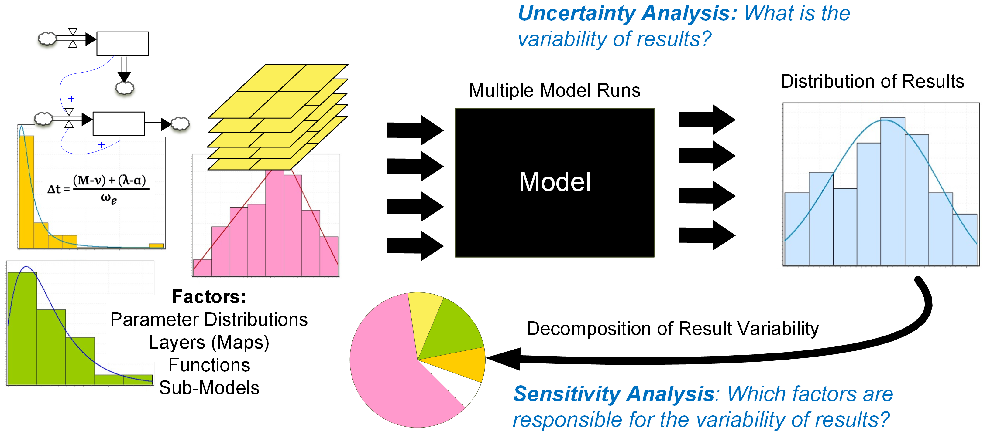
Figure 18: Uncertainty analysis and sensitivity analysis (Ligmann-Zielinska et al. 2014)
Closely related concepts must be distinguished: uncertainty analysis (UA) aims to explore the variability of the results; whereas sensitivity analysis (SA) explores the factors responsible for such variability. Robustness is considered when conducting uncertainty analysis; defined as “the ability of a system to resist change without adapting its initial stable configuration” (Wieland and Marcus Wallenburg 2012), it can be understood as insensitivity to changes (Maier et al. 2016) or also a function of performance under many states of the world. In the context of decision making, a decision is qualified robust if not vulnerable to changes, i.e. if it leads to the desired outcomes under different states of the world. However, the concept of robustness is somehow vague, and cover several interpretations overlapping with UA and SA. For example, assessing the robustness of many runs resulting from uncertain inputs or model assumptions can be considered as a sensitivity analysis (Pianosi et al. 2016).
The following discussion is limited to scalar and spatial data, leaving aside data types that are rarely encountered in the context of natural capital information such as 3D datasets, that are further explored by Brodlie et al. (2012).
3.4.2 Non-spatial data uncertainty displays
Not only does uncertainty adds a dimension to the visualization, it is especially complex because it depends directly on the data itself, and also because uncertainty propagates, i.e. if the data is transformed to be visualized, its underlying uncertainty propagates, not necessarily in a trivial way (Correa et al. 2009). Uncertainty can be presented in different ways, for example as a function of the data, (as a PDF, as a multi-value data) or as bounded data.
For one dimensional scalar data, uncertainty can be represented with error bars (Ehlschlaeger et al. 1997). Box plots are also common to express variability by showing the quartiles. An extension of these are the violin plots, additionally displaying the probability density (kernel density estimation) of the data at each value (Hintze and Nelson 1998).
Contouring by displaying around the mean an indication of the spread, or the standard deviation, allow to visualize the range among which the variable can locate (Brodlie et al. 2012). This is common for time-series datasets.
3.4.3 Spatial data uncertainty metrics
Many ES analysts (responding to the survey) came to the conclusion that uncertainty seems best understood in an aspatial manner, as spatial representations can often be difficult to digest. At NatCap, visualizing uncertainty has generally been handled via tabular representations or in a narrative format (according to survey answers). In this context, summary metrics are necessary.
In general for uncertainty analysis, two statistics are very relevant to display: a measure of central tendency, such as the mean, and an indicator of dispersion, for example the variance or standard deviation (Ligmann-Zielinska et al. 2014), but also extrema (minimum and maximum, or extreme percentiles); these measures of range are the most relevant when dealing with deep uncertainty (see also Hadka et al. (2015)).
There are also specific measures for robustness, based on the fraction of states of the world in which a conclusion remains valid or a strategy performs acceptably. Robustness measures of two types: regret and satisficing measures. The former seek to minimize expected loss, that is difference with respect to the solution that would be chosen under perfect information, ; the latter seek to maximize the range of solutions that are “good enough” (Hadka et al. 2015). Robustness of an output is contingent upon the consistency between multiple runs leading to this output, under varying conditions. Therefore, spatial metrics measuring agreement between multiple runs, as detailed in sections sec:metricsmultrunscat and sec:metricsmultrunscont can be used for assessing robustness, and will not be repeated here, to avoid redundancy. Furthermore, there is an approach specific to robustness in the context of decision making. Methods based on the breakeven point inquire about the magnitude of change that would result in changing the decision. In the context of spatial targeting, the breakeven ratio is defined as the prioritization score of the best choice over the prioritization score of the second best choice. This metric applied to spatial data result in prioritization score breakeven maps, which are efficient displays of how much the prioritization score of the chosen category would need to be reduced before switching to the second best category (Bryant et al. 2015)
3.4.4 Spatial data uncertainty map displays
The most common static visualization techniques for spatial data uncertainty include:
Juxtaposition of an uncertainty map
That is adding a separate similar figure to represent solely uncertainty (via a choropleth or heatmap with a sequential color scheme expressing a measure of uncertainty for example), alongside the representation of the data.
Overlaying an uncertainty variable
Another approach consists in overlaying a visualization of uncertainty on top of the main one. (Bingham and Haines 2006) overlays a contour map of an error field on top of a heatmap of the mean value of a multivalue dataset, but it is not so straightforward. Integrating additional geometrical objects, such as labels, volume rendered thickness, or error bars may express uncertainty (Griethe and Schumann 2006). Circular glyphs and ribbons have been designed, in the context of weather forecast ensemble data, to visualize uncertainty (Sanyal et al. 2010).
Modifying the displayed variable to account for uncertainty
Varying the value of a free graphical variable, such as a property of the color palette used to visualize the main data, can also express uncertainty. The first option is “blurring”: the focus is adapted proportionally to the level of uncertainty, this can be done through one of these parameters: contour crispness (“fuzzyness”), fill clarity or resolution (Maceachren 1992). Formally, blurring is defined as removing spatial high frequency details (Russ 1995). Saturation is the second option, in which uncertainty is expressed by paleness, also referred to as whiteness (Hengl 2003). More options include texture and edge crispness variations, overall all these solutions are more intuitive but less precise (Griethe and Schumann 2006).
Figure 19: Examples of uncertainty displays for a spatial variable: (a) blurring by Maceachren (1992) (b) whiteness by Hengl (2003)
Agreement maps
Techniques for comparison of multiple spatial runs, such as frequency maps or spaghetti plots, can be applied in the context of uncertainty. See section sec:comp_map_many.
Interactive options
In dynamic visualization, uncertainty representation can be more easily achieved. A swap button can allow the user to successively visualize the main data and its associated uncertainty on the same background map, allowing easier interpretation, with the possibility of going back and forth. This method is referred to as toggling (Aerts et al. 2003). Other interactive options include the clickable map, where uncertainty information displays upon click (Wel et al. 1998). There has also been attempts to express imprecision dynamically addressing human senses via vibrations proportional to the level of uncertainty (Brown 2004), or smooth animation of sequence of different realizations of a model (Ehlschlaeger et al. 1997). There have even been attempts to display uncertainty by adding another dimension via sounds (S.K. Lodha and Sheehan 1996)(Fisher 1994). Another solution to convey accuracy is probabilistic animation: the uncertain points appear and disappear according to their accuracy, i.e. the probability domain is sampled over time (Lundstrom et al. 2007).
Maps of uncertainty metrics per pixel stack
Another strategy is to combine uncertainty metrics with maps, by displaying statistics calculated across cell stacks (a cell-wise function applied to each element of the map stack). For example, a map could show measures of dispersion like standard deviation or extremum, or measure of robustness such as the amount of time the cell has value in a certain range (for continuous data) or is assigned to a specific category (for categorical data). This approach has been considered, with the example of the Shannon diversity index, in section sec:comp_map_many.
The techniques described above were mainly developed for continuous data, but can be adapted to categorical data. However specific techniques for categorical spatial data exist. In the context of land covers, prioritization score maps express the efficiency of a landcover/activity with regards to an objective (Bryant et al. 2015)
3.4.5 Parametric uncertainty: sensitivity analysis displays
Sensitivity analysis aims to understand the influence of the inputs, and their uncertainty, on the outputs and their uncertainties of a model (Pianosi et al. 2016). To visualize the input/output relationship, a common and direct way is a scatterplot (for each input parameter, with input parameter considered on x-axis and the output on y-axis), the relationship is explicitly revealed, especially in the case of strctured dependencies. This corresponds to the so-called O(F)AT (one factor at a time) method (detailed by Hamby (1994), and examplified by Murphy et al. (2004) among others). However, with a high number of inputs, scatterplots can become cumbersome. Then, partial derivative of the output by one factor can be displayed to assess the impact of small perturbations; however it explores only locally the input space around a baseline. Other metrics such as the percentage of output change per percentage of input change, or sensitivity indices are also used. More details can be found in (Hamby 1994).
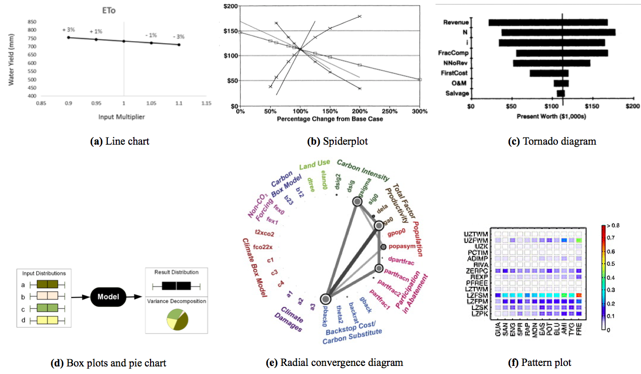
Figure 20: Examples of plots to express sensitivity analysis (a) Line plot shows the impact of change in an input parameter (ETo) on the output variable (water yield) (Vogl et al. 2014). (b) Spiderplot (c) Tornado diagram (d) Expressing sensitivity analysis through variance decomposition, with box plots and pie charts by Ligmann-Zielinska et al. (2014). (e) Radial convergence diagram, displaying Sobol sensitivity results for 30 parameters grouped in 10 categories, from Butler et al. (2014). (f) Pattern plot, evaluating sensitivity for 12 watersheds and 14 parameters, using the Sobol sensitivity index over a 38-year period, by Werkhoven et al. (2008). See also Pianosi et al. (2016), Appendix A.
Line plots express sensitivity analysis by showing the impact of change in an input parameter the output variable: the most horizontal the line is, the less sensitivity to the considered parameter. Spiderplots20 are an upgrade of the line plot, to combine several factors. They display the total impact of factors, and highlight their relative importance. Additionally they include limit values and impact on output of each input, and also the amount of change in input leading to breakeven point. However, the amount of factors displayed is limited (to about 7 according to Eschenbach (1992)). These are 2D plots, with percentage of change from baseline on x-axis, and output values on y-axis, and several lines corresponding to each input.
Variance decomposition is another approach to sensitivity analysis; then pie charts displaying variance partitions are a good alternative (Lee et al. 2015). In contrast to trying to display the impact of each inputs, variance-based method focus on finding the most influencing factors. The output variance is decomposed into parts corresponding to the contribution of each input, therefore displaying its impact on total variance (Homma and Saltelli 1996). Pie charts are widely used mostly because they are easy to build and understand. They are effective for small datasets (less than 6 segments of notably different sizes), and if segments are ordered according to size (Todd 2016). Because they are only effective on small datasets, and inadequate for comparisons (between several pie charts), partisans of high density space-effective displays, like Tufte, argue against these charts.
Tornado diagrams are also used to visualize the total impact of factors, and highlight their relative importance (Eschenbach 1992). They are horizontal bar charts corresponding to each input, plotted on the axis of output values. Pianosi et al. (2016) gathers examples of helpful visualization tools for global SA (see her Appendix A).
Radial convergence diagrams arrange input parameters in logical groups around a circle, and express, for each input its influence on output, and interactions with other input parameters. The size of inner circle of each input is proportional to its direct influence. The size of the outer circle (ring) reflects its total influence (including interactions). The interactions are reflected by the lines connecting the input parameters, the lines’ width reflects the extent of the interaction (Pianosi et al. 2016).
Pattern plots are similar to temporal maps (section sec:timeseries) for sensitivity analysis. A color scale reflects the output sensitivity for each pair of inputs. On figure fig:SAe, the input parameters are listed vertically, and the study sites horizontally. Here, the study sites are listed according to another parameter (climate conditions), therefore facilitating visual understanding of trends (Pianosi et al. 2016)
This section focused on visualization, but there are many ways to conduct a sensitivity analysis, using landscape comparison metrics described in section sec:comp_stat_cat_many. Furthermore, sensitivity analysis packages exist in multiple programming languages (e.g. SAlib for Python, sensitivity for R).
3.5 Summary
3.5.1 Key take-aways
With no pretention of being exhaustive, this chapter gathers strategies to display complex data in the context of ecosystem services model outputs. It takes inspirations from the current data visualizations in different fields, such as agent-based modeling and ensemble datasets.
Overall, combining multiple linked displays seems to be necessary as complexity and number of dimensions increase, as K. Potter et al. (2009) argues in the context of gaining insight on distribution of spatio-temporal simulation results, as well as the associated uncertainty. Arranging many views is also relevant to facilitate comparisons (Buja et al. 1996). Anecdotal experience suggests that some of the most impactful visualizations currently used combine interactive features and multiple linked views to deliver broad information in an organized and straight-forward way, as exemplified by The Middle Cedar Visualization in figure fig:Peter (Hawthorne 2016).
The examples, guidelines and suggestions gathered above aim to support creation of effective visualizations. Nevertheless, the main take-away is that graphs are here to support conveying the data’s message; i.e. visualizations should always be tailored to the specific need and dataset. The final visualization needs to be adapted to fit the document type and format, the audience addressed and will also depend on the functionalities of the charting tool used.
On the whole, each visualization is very context specific, therefore there is no perfect solution adapted to every case. An appropriate display must be selected or designed according to the intended goal (i.e. message to convey), the audience and the available resources (in terms of time, expertise, tools, presention medium and dataset).
3.5.2 Summary table for specific display needs
3.5.3 Resources
Useful resources
Hereafter are listed several resources that may be useful while creating visualizations.
Color palette pickers, to help choose a color theme:
- Colorbrewer, with an emphasis on maps and colorblind-friendly schemes
- Colrd, collaborative more designer-oriented website
- Adobe Kuler
Parallel coordinates plots resources:
- Ready-to-use parallel coordinates graph for multi-dimensional data
- Code to build a parallel coordinates plot in javascript with D3.js
- Explanations to build a parallel coordinates plot in Python
- R package for Multi-objective Robust Decision Making, including parallel coordinates plot and 3D scatterplot (linked together)
- To make alluvial (categorical version of parallel coordinates) plot: R package alluvial
Analysis of spatial data with Python:
- PyGeoprocessing: geoprocessing routines for GIS
- A well written blogpost about maps in Python
- And another one on the same topic
- Basemap examples
Analysis of spatial data with R:
- overview of analysis of spatial data
- Illustration of the ggmap package
- Introduction to the raster package
- Introduction to the RasterVis package, built on top of raster package
- GeoTuple (still in Beta version) an open web app for geospatial analysis with R
Other geovisualization platforms:
- A list of 19 online geovisualization tools
- Mapbox (API and libraries)
- Carto (web platform)
- Leaflet (JavaScript library)
- Mapzen (API)
Sensitivity analysis:
Layout and design:
- Image editor and layout tool online, a free alternative to Photoshop
Examples and inspiration in the ES field
- The Gallery of the Marine Planning Concierge Tool gathers great work on marine ES. These include the Mapping portal for the Belize project by Gregg Verutes and a similar map web viewer from the same author, for coastal hazard model results in the Bahamas
- Myanmar Natural Capital: a storytelling approach for a project involving multiple ecosystem services. The tools used here are D3.js, leaflet, openStreetMaps, Google Maps and photoshop.
- The Nature Conservancy also developed a visualization platform, gathering a suite of web applications based on maps, aiming to convey and/or simplify ecological concepts, assess risk, identify and compare different solutions and scenarios. For example, the coastal resilience interactive map in the Gulf of Mexico
- Collaborative GeoDesign, a web application allowing users to test land cover changes on the landscape, and informs on the expected corresponding impact on ES metrics
- Weather forecast: the NWS enhanced Data Display
- Watershed Conservation Screening Tool
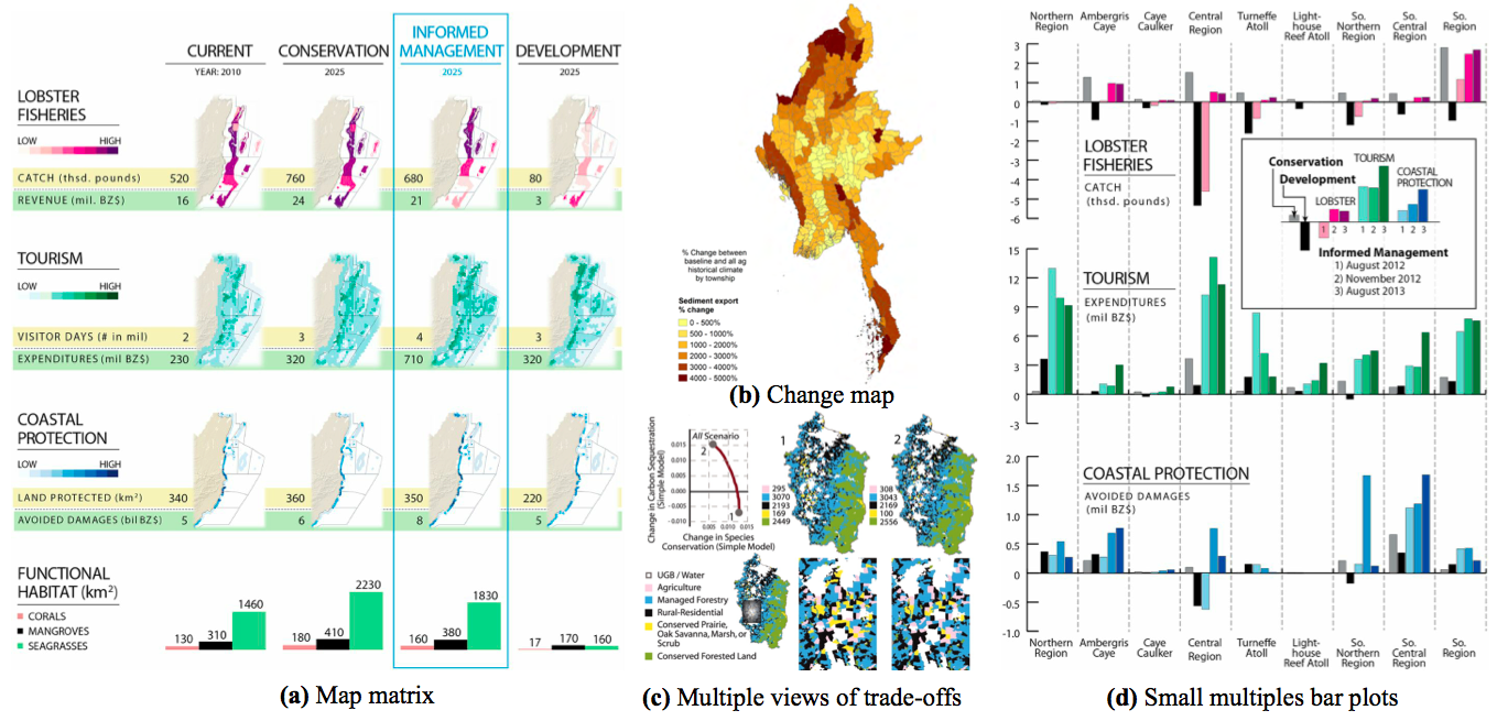
Figure 21: Additional examples (a) To compare 3 ES metrics between 4 scenarios, Arkema et al. (2015) combines small multiples of objective score maps, with summary statistics and bar plots. (b) Change map displaying the amount of additional sediment export (in percentage) comparing a future scenario with the current baseline one (Mandle et al. 2016). (c) On a static display, Nelson et al. (2008)’s strategy consists in displaying only the extreme points of the trade-off curve. (d) Change in services for all scenarios and iterations relative to current management Arkema et al. (2015)
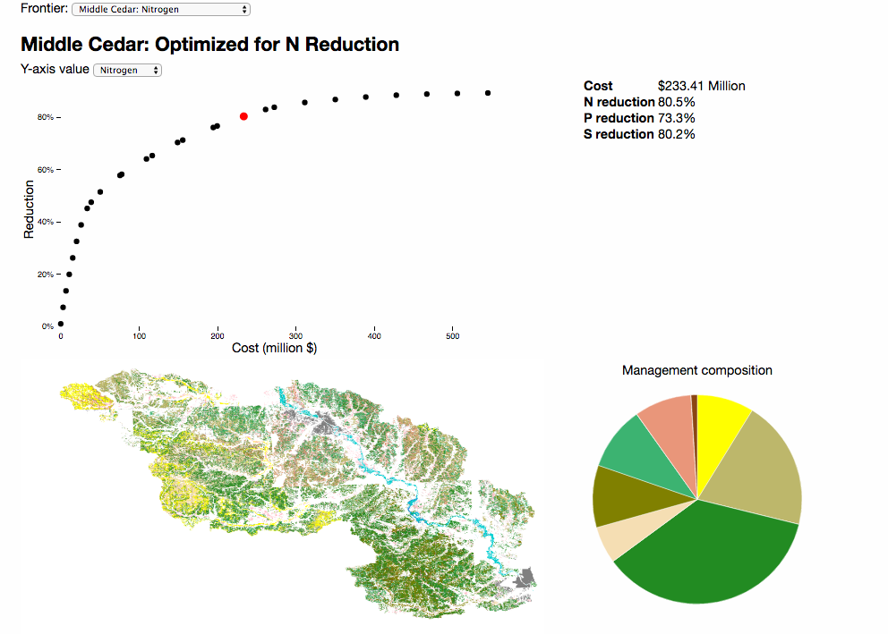
Figure 22: The Middle Cedar visualization is an interactive webapp, developed by Hawthorne (2016), who combined a scatterplot, a map, a pie chart and summary statistics in a single dashboard. It allows users to click on each point of the trade-off curve, and the corresponding land cover map will be displayed. Additionally, summary metrics and a pie chart provide information relative to the scenario chosen upon click (Hawthorne 2016)
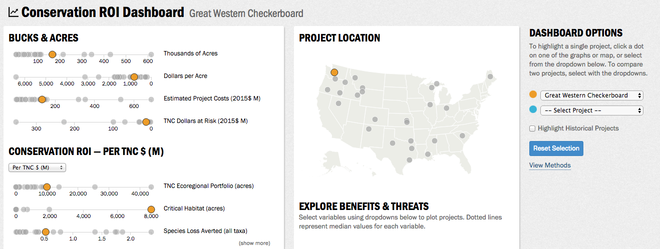
Figure 23: Extract of the Conservation ROI Dashboard, gathering and comparing ROI projects across the US
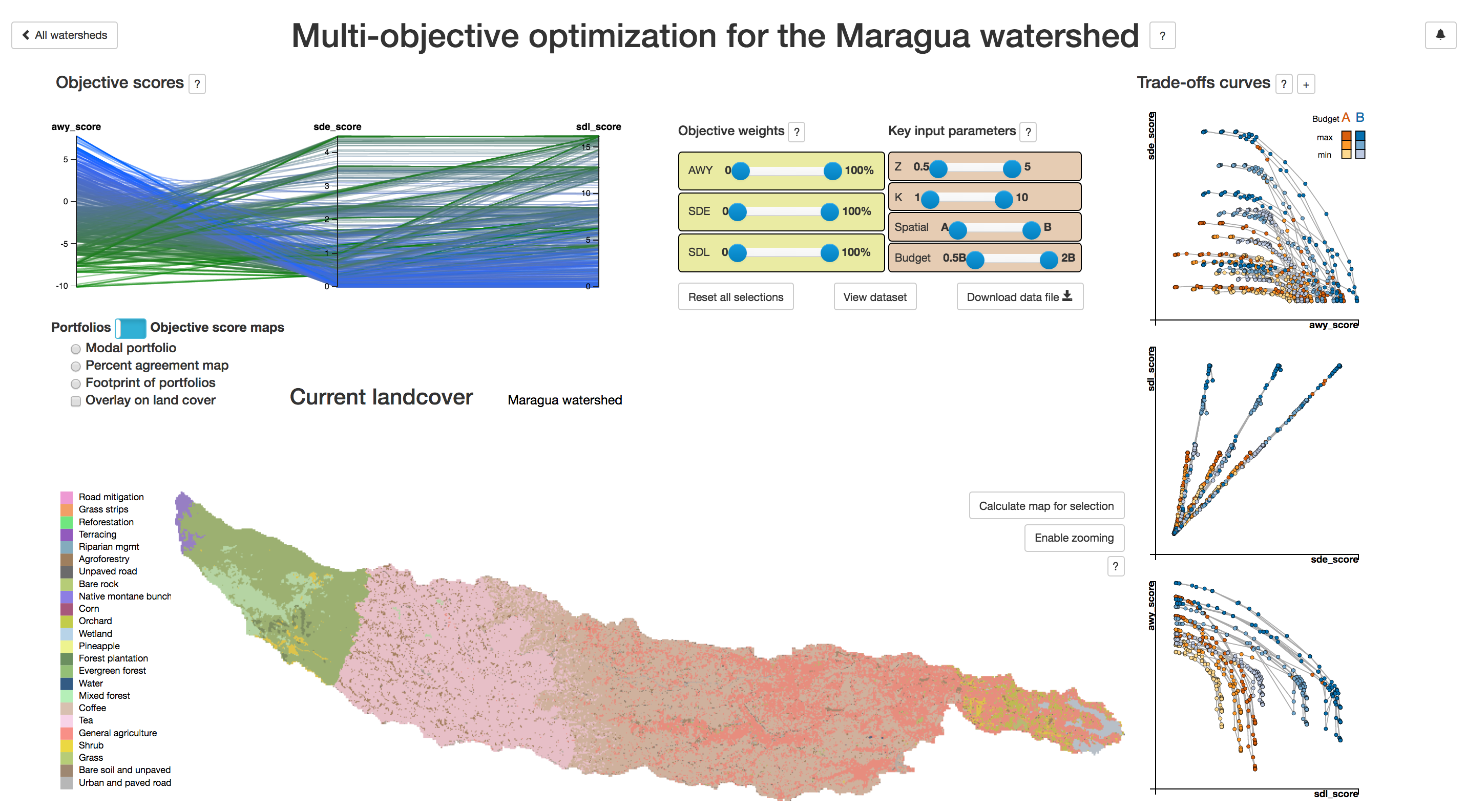
Figure 24: The Tana Water Fund interactive dashboard allows visualization of tradeoffs between objectives, comparison of scenarios and assessment of uncertainty. The current version is a prototype laying out the concept for a more generic tool
3.5.3.1 Broader inspiration sources
- Flowing data: General data visualization ideas in blog format
- The Water in the West: displaying reservoirs capacities linking a map of reservoirs to capacity graphs
- Live CO2 emissions of electricity consumption: an interactive map
4 Conclusion
4.1 On standardizing approaches to communicate natural capital results
As many in the ES community are calling for a standardized method to quantify and map ES (Englund et al. (2017), Crossman et al. (2013), Martínez-Harms and Balvanera (2012)), a number of strategies are being developed on the visualization front. Interactive tools are becoming increasingly common, as platforms to develop them are becoming more and more accessible.
Similarly to Englund et al. (2017), this study finds it difficult to point one best method generically adequate to all cases. Rather, best practices were suggested in a display “toolbox” (chapters sec:elements and sec:UserGuide). Approaches are very context dependent. The tools and types of display must be chosen according to the aim, intended audience, analyst skills, data availability, time frame and other factors.
Remain some open questions and areas of improvements were identified. The question of the scale, the effect of the resolution chosen on the results can be further explored. Additionally, the survey noted growing interest in the topic of beneficiaries. Not only quantifying the people benefiting from an intervention, but more precisely adding nuance in demographics or social metrics to the analysis, classify by subgroups (e.g. which fraction of service benefits accrue to vulnerable populations?) and/or contrast beneficiary distribution in space with service distribution in space.
The engaging aspect rising from dynamic features and the interactivity was expressed, as shown by the enthusiasm suscited by the interactive dashboard prototype developed alongside this toolbox (Weil 2017). This observation calls for development of more modern engaging tools, leveraging the abilities offered by the tools ad develoment environments becoming more and more common an accessible.
4.2 Engaging a broader audience into major decisions on natural capital sustainable management
There is an enormous potential for environmental impact and climate change mitigation through an informed management of natural capital. So called conservation finance (i.e. a financial investment that aims to conserve the values of the ecosystem for the long term, as defined by Huwyler et al. (2014)) has a large unrealized potential, there is a significant unmet demand for investment21, and aligned intentions to promote natural capital sustainable management both from the political world - as illustrated by the Paris agreement and the 17 UN sustainable development goals among others (Center for Climate and Energy Solutions (2015), Guardian (2015)) - and also emerging in the finance world (see the Conservation Finance Network for example). However, one main obstacle for investors, in the hardly measurable aspect of return on investment and conservation benefits. But natural capital assessments tackles this exact question.
Building on this observation, the hypothesis can be formulated that linking the right expertise would allow to bridge the gaps and open the doors to many desired investments and high impact projects: partnering investors looking for long term reliable and meaningful project with cutting-edge scientists modeling the behavior of ecosystems to quantify the costs and benefits from natural capital and its sustainable management. Several initiatives are going in this direction, Credit Suisse for example, expressed their long-term intent of creating a conservation finance asset class (Huwyler et al. 2016). It has been proven to be possible to deliver great conservation impacts while generating returns for investors (Huwyler et al. 2014).
However, their success seems contingent upon the ability of several fields to work together; linking different expertise seem indeed required bridge the gaps (for example through partnering investors looking for long term reliable and meaningful project with cutting-edge scientists modeling the behavior of ecosystems to quantify the costs and benefits from natural capital and its sustainable management). Multi-disciplinary communication therefore appears as a crucial aspect. In this context, data visualization tools play a key role to connect the complex scientific results to the real world.
Effective visualizations of natural capital assessment results must simplify their complexity to be understandable, while staying rigorous. Plus they communicate key points in an engaging way, allowing more actors to get involved in natural capital sustainable management. By involving a broader audience into major decisions, they support a participative and democratic approach to solving problems impacting large communities.
Advances in the topic of communication of natural capital assessments would arguably facilitate engagement of a broader audience and help natural capital conservation projects achieve their tremendous potential to impact, at large scale.
Bibliography
Achtert, E., Kriegel, H.-P., Schubert, E., and Zimek, A. (2013). “Interactive data mining with 3D-parallel-coordinate-trees.” Proceedings of the 2013 acm sigmod international conference on management of data, SIGMOD ’13, ACM, New York, NY, USA, 1009–1012.
Aerts, J. C. J. H., Clarke, K. C., and Keuper, A. D. (2003). “Testing popular visualization techniques for representing model uncertainty,” cartography and geographic.” Information Science, 249–261.
Allen, E. A., Erhardt, E. B., and Calhoun, V. D. (2012). “Data visualization in the neurosciences: Overcoming the curse of dimensionality.” Neuron, 74(4), 603–608.
Andrienko, G., and Andrienko, N. (2001). “Constructing parallel coordinates plot for problem solving.” 1st international symposium on smart graphics, 9–14.
Apperley, M. D., Tzavaras, I., and Spence, R. (1982). “A BIFOCAL DISPLAY TECHNIQUE FOR DATA PRESENTATION.” Eurographics conference proceedings, D. Greenaway and E. Warman, eds., The Eurographics Association.
Arkema, K. K., Verutes, G. M., Wood, S. A., Clarke-Samuels, C., Rosado, S., Canto, M., Rosenthal, A., Ruckelshaus, M., Guannel, G., Toft, J., Faries, J., Silver, J. M., Griffin, R., and Guerry, A. D. (2015). “Embedding ecosystem services in coastal planning leads to better outcomes for people and nature.” Proceedings of the National Academy of Sciences, 112(24), 7390–7395.
Arkema, K. K., Verutes, G., Bernhardt, J. R., Clarke, C., Rosado, S., Canto, M., Wood, S. A., Ruckelshaus, M., Rosenthal, A., McField, M., and others. (2014). “Assessing habitat risk from human activities to inform coastal and marine spatial planning: A demonstration in belize.” Environmental Research Letters, IOP Publishing, 9(11), 114016.
Beven, K. (2006). “On undermining the science?” Hydrological processes, Wiley Online Library, 20(14), 3141–3146.
Bingham, R. J., and Haines, K. (2006). “Mean dynamic topography: Intercomparisons and errors.” IPhilosophical Transactions of The Royal Society A, 903–916.
Brewer, C. (2004). Designing better maps: A guide for gis users. Environmental Systems Research.
Brodlie, K., Osorio, R. A., and Lopes, A. (2012). “A review of uncertainty in data visualization.”
Brown, D. G., Page, S., Riolo, R., Zellner, M., and Rand, W. (2005). “Path dependence and the validation of agent‐based spatial models of land use.” International Journal of Geographical Information Science, Taylor & Francis, 19(2), 153–174.
Brown, R. (2004). “Animated visual vibrations as an uncertainty visualisation technique.” Proceedings of the 2Nd international conference on computer graphics and interactive techniques in australasia and south east asia, GRAPHITE ’04, ACM, New York, NY, USA, 84–89.
Bryant, B. P., Wolny, S., and Vogl, A. L. (2015). “Understanding RIOS sensitivities , strengths , and weaknesses A demonstration in the Coyote Creek watershed.”
Bryant, and Hawthorne. (n.d.). “Quick intro to optimization.”
Buckley, A. R. (2012). “Make Maps People Want to Look At.” ArcUser, 46–51.
Buczkowski, A. (2016). “Top 19 geovisualization tools, apis and libraries that will let you create beautiful web maps.” GeoAwesomeness.com, <http://geoawesomeness.com/top-19-online-geovisualization-tools-apis-libraries-beautiful-maps/>.
Buja, A., Cook, D., and Swayne, D. F. (1996). “Interactive high-dimensional data visualization.” Journal of Computational and Graphical Statistics, 5, 78–99.
Butler, M. P., Reed, P. M., Fisher-Vanden, K., Keller, K., and Wagener, T. (2014). “Identifying parametric controls and dependencies in integrated assessment models using global sensitivity analysis.” Environmental Modelling & Software, 59, 10–29.
Cardinale, B. J., Duffy, J. E., Gonzalez, A., Hooper, D. U., Perrings, C., Venail, P., Narwani, A., Mace, G. M., Tilman, D., Wardle, D. A., and others. (2012). “Biodiversity loss and its impact on humanity.” Nature, Nature Publishing Group, 486(7401), 59–67.
Caviglia, G., and al. (2013). “Raw website.” <http://raw.densitydesign.org>.
Center for Climate and Energy Solutions. (2015). “UN Framework Convention on Climate Change (UNFCCC).” Outcomes of the UN Climate Change Conference in Paris, (December), 1–5.
Chandoo. (2008). “You are not spider man, so why do you use radar charts?”
ClarkLabs. (2015). <https://clarklabs.org/terrset/idrisi-gis/>.
Cleveland, W. S., and McGill, R. (1984). “Graphical perception: Theory, experimentation, and application to the development of graphical methods.” Journal of the American statistical association, Taylor & Francis, 79(387), 531–554.
Cohen, J. (1960). “A COEFFICIENT OF AGREEMENT FOR NOMINAL SCALES.” EDUCATIONAL AND PSYCHOLOGICAL MEASUREMENT, XX(1), 37–46.
Correa, C. D., Chan, Y.-H., and Ma, K.-L. (2009). “A framework for uncertainty-aware visual analytics.” I. P. of IEEE Symposium on Visual Analytics Science and T. V. 09, eds.
Costanza, R. (1989). “Model goodness of fit: A multiple resolution procedure.” Ecological Modelling, 47(3-4), 199–215.
Crossman, N., Burkhard, B., Nedkov, S., Willemen, L., Petz, K., Palomo, I., Drakou, E., Martín-Lopez, B., McPhearson, T., Boyanova, K., Alkemade, R., Egoh, B., Dunbar, M., and Maes, J. (2013). “A blueprint for mapping and modelling ecosystem services.” Ecosystem Services, 4, 4–14.
Cukier, K. (2010). Data, data everywhere: A special report on managing information. Economist Newspaper.
Daily, G. C., Söderqvist, T., Aniyar, S., Arrow, K., Dasgupta, P., Ehrlich, P. R., Folke, C., Jansson, A., Jansson, B.-O., Kautsky, N., and others. (2000). “The value of nature and the nature of value.” Science, American Association for the Advancement of Science, 289(5478), 395–396.
De Smith, M. J., Goodchild, M. F., and Longley, P. (2007). Geospatial analysis: A comprehensive guide to principles, techniques and software tools. Troubador Publishing Ltd.
Dean, D. J. (2005). “Measuring arrangement similarity between thematic raster databases using a quadtree-based approach.” International conference on geospatial sematics, Springer, 120–136.
Ehlschlaeger, C. R., Shortridge, A. M., and Goodchild, M. F. (1997). “Visualizing spatial data uncertainty using animation.” Computers in GeoSciences, 23(4), 387–395.
Englund, O., Berndes, G., and Cederberg, C. (2017). “How to analyse ecosystem services in landscapes—A systematic review.” Ecological Indicators, 73, 492–504.
Eschenbach, T. G. (1992). “Spiderplots versus tornado diagrams for sensitivity analysis.” Interfaces, INFORMS, 22(6), 40–46.
Fisher, P. (1994). “Animation and sound for the visualization of uncertain spatial information.” Visualization in Graphical Information Systems, Wiley, 181–185.
Fleming, P. J., Purshouse, R. C., and Lygoe, R. J. (2005). “Many-Objective Optimization: An Engineering Design Perspective.” Evolutionary Multi-Criterion Optimization: Third International Conference, EMO 2005, Guanajuato, Mexico, March 9-11, 2005. Proceedings, 14–32.
Furnas, G. W. (1986). “Generalized fisheye views.” SIGCHI Bull., ACM, New York, NY, USA, 17(4), 16–23.
Gong, J., C., X. Y., C.X, Z., and Y.J., G. (2016). “Study on watershed ecosystem service governance based on landscape ecological risk assessment: A case study of bailongjiang watershed of southern gansu, china.”
Griethe, H., and Schumann, H. (2006). “The visualization of uncertain data: Methods and problems.” SimVis, 143–156.
Guardian, T. (2015). “The 10 sustainable development goals that rainforests can help us achieve.” The Guardian, <https://www.theguardian.com/cgd-partner-zone/2017/jan/23/10-ways-tropical-forests-help-sustainable-development-goals>.
Hadka, D., Herman, J., Reed, P., and Keller, K. (2015). “An open source framework for many-objective robust decision making.” Environmental Modelling and Software, 74, 114–129.
Hagen, A. (2003). “Fuzzy set approach to assessing similarity of categorical maps.” International Journal of Geographical Information Science, 17(3), 235–249.
Hamby, D. (1994). “A review of techniques for parameter sensitivity analysis of environmental models.” Environmental monitoring and assessment, Springer, 32(2), 135–154.
Hauck, J., Görg, C., Varjopuro, R., Ratamäki, O., Maes, J., Wittmer, H., and Jax, K. (2013). “‘Maps have an air of authority’: Potential benefits and challenges of ecosystem service maps at different levels of decision making.” Ecosystem Services, 4, 25–32.
Hawthorne, P. (2016). “Middle cedar visualization.” <https://phawthorne.github.io/mc-vis/>.
Heer, J., Bostock, M., and Ogievetsky, V. (2010). “A tour through the visualization zoo.” Communications of the ACM, 53(6), 59–67.
Heer, J., Kong, N., and Agrawala, M. (2009). “Sizing the horizon: The effects of chart size and layering on the graphical perception of time series visualizations.” ACM Human Factors in Computing Systems, 1303–1312.
Hengl, T. (2003). “Visualisation of uncertainty using the hsi colour model: Computation with colours.” In Proceedings of the 7th International Conference on GeoComputation, 8–17.
Hennig, B. (2011). “Worldmapper population cartogram.” <www.viewsoftheworld.net>.
Hintze, J. L., and Nelson, R. D. (1998). “Violin plots: A box plot-density trace synergism.” The American Statistician, Taylor & Francis Group, 52(2), 181–184.
Homma, T., and Saltelli, A. (1996). “Importance measures in global sensitivity analysis of nonlinear models.” Reliability Engineering & System Safety, Elsevier, 52(1), 1–17.
Hotelling, H. (1933). “Analysis of a complex of statistical variables into principal components.” Journal of educational psychology, Warwick & York, 24(6), 417.
Huang, Q., Parker, D. C., Sun, S., and Filatova, T. (2013). “Effects of agent heterogeneity in the presence of a land-market: A systematic test in an agent-based laboratory.” Computers, Environment and Urban Systems, 41, 188–203.
Huwyler, F., Käppeli, J., and Tobin, J. (2016). “Conservation finance - from niche to mainstream: The building of an institutional asset class.” Crédit Suisse and McKinsey.
Huwyler, F., Käppeli, J., Serafimova, K., Swanson, E., and Tobin, J. (2014). “Conservation finance : Moving beyond donor funding toward an investor-driven approach.” Crédit Suisse AG, WWF and McKinsey.
Hügel, S. (2015). “So you’d like to make a map using python.” <http://sensitivecities.com/so-youd-like-to-make-a-map-using-python-EN.html#.WCpPzBRFRhN>.
Jankowski, P., Zielinska, A.-L., and Swobodzinski, M. (2008). “Choice modeler: A web-based spatial multiple criteria evaluation tool.” Transactions in GIS, 12(4), 541–561.
K. Potter, A. W., P.-t. Bremer, D. W., C. Doutriaux, V. P., and Johnson, C. (2009). “Ensemble-vis: A framework for the statistical visualization of ensemble data.” I. P. of the 2009 IEEE International Conference on Data Mining Workshops, ed., IEEE Computer Society, 233–240.
Kader, G. D., and Perry, M. (2007). “Variability for categorical variables.” Journal of Statistics Education, American Statistical Association. 732 North Washington Street, Alexandria, VA 22314, 15(2), 1–17.
Kahle, D., and Wickham, H. (2013). “Ggmap: Spatial visualization with ggplot2.” The R Journal, 5(1), 144–162.
Keim, D. A. (2000). “Designing Pixel-oriented Visualization Techniques : Theory and Applications.” 6(1), 59–78.
Kelleher, C., and Wagener, T. (2011). “Ten guidelines for effective data visualization in scientific publications.” Environmental Modelling & Software, 26(6), 822–827.
Kitsiou, D., and Karydis, M. (2000). “Categorical mapping of marine eutrophication based on ecological indices.” Science of The Total Environment, 255(1–3), 113–127.
Koehler. (2014). “Using a temporal information system for visualization and analysis of hydrologic time-series data.”
Kollat, J. B., and Reed, P. (2007). “A framework for Visually Interactive Decision-making and Design using Evolutionary Multi-objective Optimization (VIDEO).” Environmental Modelling and Software, 22(12), 1691–1704.
Kosslyn, S. M., and Chabris, C. F. (1992). “Minding information graphics.” Folio: the Magazine for Magazine Management, 21(2), 69–71.
Kuhnert, M., Voinov, A., and Seppelt, R. (2005). “Comparing Raster Map Comparison Algorithms for Spatial Modeling and Analysis.” Photogrammetric Engineering and remote Sensing (PE&RD), 71(8), 975–984.
Lamping, J., Rao, R., and Pirolli, P. (1995). “A focus+context technique based on hyperbolic geometry for visualizing large hierarchies.” Proceedings of the sigchi conference on human factors in computing systems, CHI ’95, ACM Press/Addison-Wesley Publishing Co., New York, NY, USA, 401–408.
Lee, J.-S., Filatova, T., Ligmann-Zielinska, A., Hassani-Mahmooei, B., Stonedahl, F., Lorscheid, I., Voinov, A., Polhill, J. G., Sun, Z., and Parker, D. C. (2015). “The complexities of agent-based modeling output analysis.” Journal of Artificial Societies and Social Simulation, 18(4), 4.
Leung, Y. K., and Apperley, M. D. (1994). “A review and taxonomy of distortion-oriented presentation techniques.”
Ligmann-Zielinska, A., Kramer, D., Spence Cheruvelil, K., and Soranno, P. A. (2014). “Using uncertainty and sensitivity analyses in socioecological agent-based models to improve their analytical performance and policy relevance.” PLOS ONE, Public Library of Science, 9(10), 1–13.
Lourenco, F., Lobo, V., and Bacao, F. (2004). “Binary-based similarity measures for categorical data and their application in self-organizing maps.” JOCLAD.
Lundstrom, C., Ljung, P., Persson, A., and Ynnerman, A. (2007). “Uncertainty visualization in medical volume rendering using probabilistic animation ieee transactions on visualization and computer graphics 13 (6).” 1648–1655.
Maceachren, A. M. (1992). “Visualizing uncertain information.” Cartographic Perspectives, 13, 10–19.
Mackinlay, J. D., Robertson, G. G., and Card, S. K. (1991). “The perspective wall: Detail and context smoothly integrated.” Proceedings of the sigchi conference on human factors in computing systems, CHI ’91, ACM, New York, NY, USA, 173–176.
Maier, H., Guillaume, J., Delden, H. van, Riddell, G., Haasnoot, M., and Kwakkel, J. (2016). “An uncertain future, deep uncertainty, scenarios, robustness and adaptation: How do they fit together?” Environmental Modelling & Software, 81, 154–164.
Mandle, L., Wolny, S., Hamel, P., Helsingen, H., Bhagabati, N., and Dixon, A. (2016). “Natural connections: How natural capital supports Myanmar’s people and economy.”
Manson, S. M. (2005). “Agent-based modeling and genetic programming for modeling land change in the Southern Yucat??n Peninsular Region of Mexico.” Agriculture, Ecosystems and Environment, 111(1-4), 47–62.
Martínez-Harms, M. J., and Balvanera, P. (2012). “Methods for mapping ecosystem service supply: A review.” International Journal of Biodiversity Science, Ecosystem Services & Management, 8(1-2), 17–25.
Matkan, A. A., Shahri, M., and Mirzaie, M. (2013). “Bivariate moran’s i and lisa to explore the crash risky locations in urban areas.” Proceedings of the conference of network-association of european researchers on urbanisation in the south, enschede, the netherlands, 12–14.
McMahon, R., Stauffacher, M., and Knutti, R. (2016). “The scientific veneer of ipcc visuals.” Climatic Change, 138(3), 369–381.
Medeiros, D. (2016). “An introduction to gis using arcgis.” Stanford Geospatial Center, Stanford University; University Lecture.
Murphy, J. M., Sexton, D. M., Barnett, D. N., Jones, G. S., Webb, M. J., Collins, M., and Stainforth, D. A. (2004). “Quantification of modelling uncertainties in a large ensemble of climate change simulations.” Nature, Nature Publishing Group, 430(7001), 768–772.
Natural Capital Scotland Ltd. (2015). “World forum on natural capital, edinburgh, uk.” <naturalcapitalforum.com/about/>.
Nelson, E., Polasky, S., Lewis, D. J., Plantinga, A. J., Lonsdorf, E., White, D., Bael, D., and Lawler, J. J. (2008). “Efficiency of incentives to jointly increase carbon sequestration and species conservation on a landscape.” Proceedings of the National Academy of Sciences, National Acad Sciences, 105(28), 9471–9476.
Pareto, V. (1896). Cours d’Économie politique professé a l’Université de lausanne.
Parker, D. C., and Meretsky, V. (2004). “Measuring pattern outcomes in an agent-based model of edge-effect externalities using spatial metrics.” Agriculture, Ecosystems & Environment, 101(2–3), 233–250.
Percy, S., and Lubchencho, J. (2005). “Ecosystems and human well being–opportunities and challenges for business and industry.” Millennium Ecosystem Assessment.
Pianosi, F., Beven, K., Freer, J., Hall, J. W., Rougier, J., Stephenson, D. B., and Wagener, T. (2016). “Sensitivity analysis of environmental models: A systematic review with practical workflow.” Environmental Modelling & Software, 79, 214–232.
Pontius, G. R. (2000). “Quantification error versus location error in comparison of categorical maps.” Photogrammetric Engineering and Remote Sensing, 66(8), 1011–1016.
Pontius, R. G., and Millones, M. (2011). “Death to kappa: Birth of quantity disagreement and allocation disagreement for accuracy assessment.” International Journal of Remote Sensing, 32(15), 4407–4429.
Power, C., Simms, A., and White, R. (2001). “Hierarchical fuzzy pattern matching for the regional comparison of land use maps.” International Journal of Geographical Information Science, Taylor & Francis, 15(1), 77–100.
Rand, U. W. W. (2015). An introduction to agent-based modeling. MIT Press.
Reed, P. M., and Minsker, B. S. (2004). “Striking the Balance: Long-Term Groundwater Monitoring Design for Conflicting Objectives.” Journal of Water Resources Planning and Management, 130(2), 140–149.
Reichert, P., and Borsuk, M. E. (2005). “Does high forecast uncertainty preclude effective decision support?” Environmental Modelling & Software, Elsevier, 20(8), 991–1001.
Remmel, T. K., and Csillag, F. (2006). “Mutual information spectra for comparing categorical maps.” International Journal of Remote Sensing, Taylor & Francis, 27(7), 1425–1452.
Ribecca, S. (n.d.). “Data visualization catalogue.” <http://datavizcatalogue.com>.
Ritters, K., O’Neill, R., Hunsaker, C., Wickham, J., Yankee, D., Timmins, S., Jones, K., and Jackson, B. (1995). “A factor analysis of landscape pattern and structure metrics.” Landscape Ecology, 10(1), 23–39.
Roth, R. E., and Harrower, M. (2008). “Addressing map interface usability: Learning from the lakeshore nature preserve interactive map.” Cartographic Perspectives, (60), 46–66.
Russ, J. C. (1995). The image processing handbook. Boca Raton, CRC Press, 2nd Edition, 674 p. (ISBN 0-8493-2516-1).
S.K. Lodha, C.M. Wilson, and Sheehan, R. (1996). “LISTEN: Sounding uncertainty visualization.” In Proceedings of Visualization 96, 189–195.
Sanyal, J., Zhang, S., Dyer, J., Mercer, A., Amburn, P., and Moorhead, R. J. (2010). “Noodles: A tool for visualization of numerical weather model ensemble uncertainty.” Visualization and Computer Graphics, 16, 1421–1430.
Seppelt, R., and Voinov, A. (2003). “Optimization methodology for land use patterns—evaluation based on multiscale habitat pattern comparison.” Ecological Modelling, 168(3), 217–231.
Specht, R. L. (1981). Heathlands and related shrublands : Analytical studies. Elsevier Scientific Pub.
Stephens, E. M., Edwards, T. L., and Demeritt, D. (2012). “Communicating probabilistic information from climate model ensembles—lessons from numerical weather prediction.” Wiley interdisciplinary reviews: climate change, Wiley Online Library, 3(5), 409–426.
Sun, S., Parker, D. C., Huang, Q., Filatova, T., Robinson, D. T., Riolo, R. L., Hutchins, M., and Brown, D. G. (2014). “Market impacts on land-use change: An agent-based experiment.” Annals of the Association of American Geographers, 104(3), 460–484.
Teo, H.-H., Oh, L.-B., Liu, C., and Wei, K.-K. (2003). “An empirical study of the effects of interactivity on web user attitude.” International Journal of Human-Computer Studies, 58(3), 281–305.
Todd, C. (2016). “The pros and cons of pie charts (mostly the cons though).” Stytch, <https://www.stytch.com/pros-cons-pie-charts-data-visualization/>.
Torres, N. (2016). “Why it’s so hard for us to visualize uncertainty.” Harvard Business Review.
Trindade, B. (2017). “Alluvial plots.” Water Programming: A Collaborative Research Blog, <https://waterprogramming.wordpress.com/2017/01/21/alluvial-plots/>.
Troy, A., and Wilson, M. (2006). “Mapping ecosystem services: Practical challenges and opportunities in linking gis and value transfer.” Ecological Economics, 60(2), 435–449.
Tufte, E. (1983). The visual display of quantitative information. The visual display of quantitative information, Graphics Press.
Vallandingham, J. (n.d.). “How to animate transitions between multiple charts.” <http://flowingdata.com/2013/01/17/how-to-animate-transitions-between-multiple-charts>.
Van Rijsbergen, C. (1979). “Information retrieval. dept. of computer science, university of glasgow.” URL: citeseer. ist. psu. edu/vanrijsbergen79information. html, 14.
Verutes, G., Stacie Wolny, G. K., and Wyatt, K. (2015). “Getting started with a natural capital approach.”
Villamor, G. B., Le, Q. B., Djanibekov, U., Noordwijk, M. van, and Vlek, P. L. (2014). “Biodiversity in rubber agroforests, carbon emissions, and rural livelihoods: An agent-based model of land-use dynamics in lowland sumatra.” Environmental Modelling & Software, 61, 151–165.
Visser, H., and De Nijs, T. (2006). “The map comparison kit.” Environmental Modelling & Software, Elsevier, 21(3), 346–358.
Vitousek, P. M., Mooney, H. A., Lubchenco, J., and Melillo, J. M. (1997). “Human domination of earths ecosystems.” Science, American Association for the Advancement of Science, 277(5325), 494–499.
Vogl, A., Tallis, H., Douglass, J., Sharp, R., Wolny, S., Veiga, F., Benitez, S., León, J., Game, E., Petry, P., Guimerães, J., and Lozano, J. S. (2016). “Resource investment optimization system (rios) documentation v1.1.16.”
Vogl, A., Wolny, S., Hamel, P., Johnson, J., Rogers, M., and Dennedy-Frank, J. (2014). “Valuation of hydropower services (technical support for himachal pradesh development policy loan).”
Wada, C., Bremer, L., Burnett, K., Trauernicht, C., Giambelluca, T., Mandle, L., Parsons, E., Weil, C., and Ticktina, T. (2017, in review). “Prioritizing management investments at pu‘u wa‘awa‘a, hawai‘i using spatial changes in water yield and landscape flammability under forest restoration and climate change.”
Ward, M. (1994). “Xmdvtool: Integrating multiple methods for visualizing multivariate data.” Proceedings of the conference on visualization’94, IEEE Computer Society Press, 326–333.
Ware, C. (2000). “Information visualization: Perception for design morgan kaufmann.” New York.
Weil, C. (2017). “NATURAL capital data visualization to promote sustainable decision making.” Master thesis.
Wel, F. J. V. der, Gaag, L. C. V. der, and Gorte, B. G. (1998). “Visual exploration of uncertainty in remote-sensing classification.” Computers & Geosciences, 24(4), 335–343.
Werkhoven, K. van, Wagener, T., Reed, P., and Tang, Y. (2008). “Characterization of watershed model behavior across a hydroclimatic gradient.” Water Resources Research, Wiley Online Library, 44(1).
Wickham, H. (2008). A layered grammar of graphics.
Wieland, A., and Marcus Wallenburg, C. (2012). “Dealing with supply chain risks: Linking risk management practices and strategies to performance.” International Journal of Physical Distribution & Logistics Management, Emerald Group Publishing Limited, 42(10), 887–905.
Wilhelm, A., Unwin, A. R., and Theus, M. (1995). “Software for interactive statistical graphics-a review.” Proc. int. softstat ‘95 conf., heidelberg, germany.
Wilkinson, L. (2006). The grammar of graphics. Springer Science & Business Media.
Wilson, A., and Potter, K. (2009). “Toward Visual Analysis of Ensemble Data Sets.” UltraVis ’09 Proceedings of the 2009 Workshop on Ultrascale Visualization, 48–53.
Winer, E. H., and Bloebaum, C. L. (2002). “Development of visual design steering as an aid in large-scale multidisciplinary design optimization. Part II: Method validation.” Structural and Multidisciplinary Optimization, 23(6), 425–435.
evaluated by the Millennium Assessments (Percy and Lubchencho 2005).↩
Normalizing a scale to a common one for reference in comparison, or apply a more sophisticated transformation to the data, relevant to the specific case (e.g. divide by population).↩
The faceting specification is relative to the coordinate system, it “describes which variables should be used to split up the data, and how they should be arranged” (Wickham 2008).↩
Normalizing a colorscale consists in adjusting the scale to a reference one for comparison or to a more sophisticated one depending on the context.↩
Useful links about analysis of spatial data in R:
- overview of analysis of spatial data
- Illustration of the ggmap package
- Introduction to the raster package
- Introduction to RasterVis, which builds on raster package↩Useful links to make maps using Python (with matplotlib and basemap): a well written blogpost, another one, and basemap examples.↩
Vocabulary note: “multi-objective” refers here to problems with three or more objectives, also called many-objective problems (Fleming et al. 2005) or high order-Pareto optimization problems (Reed and Minsker 2004)↩
To avoid confusion, we clarify here that figure fig:scatterplotsb is not a SPLOM, as the axis correspond to the same variables in every multiple. A SPLOM would display plots where each the axis correspond to different variables in each multiple, to show pairwise correlation information. An example can be found in figure 2 here.↩
A side concern that may come up in these cases, is about data management: the total size of the runs can become is too large for available main memory. A strategy is to precompute summary statistics, such as the mean and extrema (Wilson and Potter 2009).↩
Links to parallel coordinates and alluvial plots implementations and packages:
- A tool to build directly an interactive parallel coordinate plot
- Its underlying implementation, with D3.js
- Parallel plots in Python
- Interactive parallel plots in R, with Shiny and 3D scatterplot
- Alluvial plot package in R.↩Spiderplots or spidercharts is a blurry term to that has been used to refer both to 2-axis spiderplots (as in figure fig:SA_overallb), but also to multi-axis spiderplots which are also referred to as radar chart (as in figure fig:coastal_sma).↩
see also petal charts, and discussion from Chandoo (2008).↩
Normalizing here consists in dividing the variable of interest per unit area; e.g. to express population, the population per square kilometer should be displayed.↩
The text translates to: The numbers of men present are represented by the width of the colored zones at a scale of one millimeter for every ten thousand men; they are further written across the zones. The red designates the men who enter into Russia, the black those who leave it. The information which has served to draw up the map has been extracted from the works of M. M. Thiers of Ségur, of Fezensac, of Chambray and the unpublished diary of Jacob, the pharmacist of the army since october 28th. In order to better judge with the eye the diminution of the army, I have assumed that the troops of Prince Jérôme and the Marshal Davoush who had been detached at Minsk and Mokilow and have rejoined around Orcha and Vitebsk had always marched with the army. ](../images/Minard.png){#fig:minard}↩
Inconsistent terminology note: sometimes the word scenarios is used to refer to a portfolio. Unfortunately, this term has been used with many meanings depending on the context and niche modeling community, including a more general meaning of a specific realization of uncertain exogenous input variables. Thus one might also develop a “portfolio” of targeted interventions under multiple (exogenous) scenarios.↩
MCK compares raster maps using fuzzy set map comparison, hierarchical fuzzy pattern matching, and moving window based comparison of landscape structure. See MCK website.↩
More precisely, the modal portfolio maps can either display the category assigned in most of the runs, or limit to these assigned in a certain threshold percentage of the runs.↩
Terminology note: Following Kuhnert et al. (2005), in this section, “cell” corresponds to the regional unit at which data is aggregated, also referred to as SDU, it can be a region, a pixel, a hydrological area or a state for example.↩
Spiderplots or spidercharts is a blurry term to that has been used to refer both to 2-axis spiderplots (as in figure fig:SA_overallb), but also to multi-axis spiderplots which are also referred to as radar chart (as in figure fig:coastal_sma).↩
Huwyler et al. (2014) calculates that, to meet the global need for conservation funding, investable cash flows from conservation projects need to be at least 20-30 times greater than they are today, reaching USD 200-300 billion per year.↩